A place for talking about art, social issues, and most anything else I think THAT'S INKED UP.
Tuesday, May 10, 2016
Jose Francisco Borges' Prints on the Life and Culture of Brazil
José Francisco Borges was born in 1935 in Bezerros, Brazil. He is Latin America’s best-known folk artist working in relief, and his work has been exhibited all over the world. He comes out of a long tradition of folk poet/artists who publish their own work in the form of small inexpensive chap-books written in verse, known as folhetos or literatura de cordel, because vendors sell them in the marketplace, hanging over a string.
The backcountry of Brazil is as big as the state of Texas, and it is filled with cowboys, bandits, simple folk and a strong sense of faith. The people from this area are descended from the Portuguese, and they have come to enjoy hearing story-telling poems set to song. These poems are sung by traveling minstrels who spread local gossip as they move from town to town. Frequently, vendors sing these songs to market crowds, many of whom are illiterate, and their voices usually draw enormous gatherings.
Brazilian chap books deal with popular poetry, accounts of local catastrophes, popular legends, famous crimes, and infamous love affairs. The front of these pamphlets usually contain simple, eye-catching illustrations of the book's contents, and they have become a special type of folk art.
Borges worked as a child in the remote fields of north-east Brazil. In his 20s, he started trading, making and illustrating books of popular poems, which lead him from Brazil’s backlands to exhibitions at some of the most prestigious art museums in the world. When Borges wrote and illustrated his first book, he sold 5,000 copies in two months! He has created over 250.
In the 1960s, Borges began writing folhetos, and soon also began to operate a printing press to produce woodcut prints for their covers. He then started producing folio-sized prints from their woodcuts, transforming them into an art form by themselves.
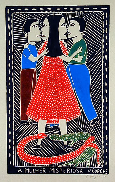
His bold, naive compositions, inspired by politics and folklore, are prized by collectors and shown in exhibitions around the world. Borges received a UNESCO cultural award in 2000. Borges still lives and works in Bezerros. He retains a plain view of his inspiration, saying: “I carve what I see.”
Borges work is simple, colorful and exudes a felling of childlike wonder. His images of two-timing women, marriage and fighting the temptations of the Devil are all done in a playful manner, easy for the viewer to digest.
Many galleries handle Borges' work, and you can easily find them online for a song. No pun intended. Snap some up, my dear inked up comrades, as we must support our brethren.
Monday, April 25, 2016
Werner Drewes' Abstractions in Print
I recently saw the work of Werner Drewes and thought, "Man, how did I never see this person's work before?" It is pretty spectacular, in range and subject. He is a master of the cut mark and composition. The Variety of his color work is soft to bold and the simplicity of a female portrait is so complex it shatters our notions of a simple, yet descriptive mark. I, for one, am riveted by his work, and I hope you will enjoy this man's oeuvre as much as I have. Be sure to share this article with anyone working in printmaking, because we need to share our fellow printmaker's work with each other.
Werner Drewes (1899–1985) was a German-American artist/teacher widely considered to be one of the founding fathers of American abstraction, and one of the first artists to introduce the ideas of the Bauhaus school to the United States.
Drewes was born in Canig, Germany. In 1917, he was drafted by the German army and served in France. After the war, he made art and traveled Europe. He studied architecture at both the Königlich Technischen Hochschule Charlottenburg and at the Technischen Hochschule Stuttgartand. He then enrolled in Stuttgart's school of applied arts (Kunstgewerbeschule) and joined a group of artists and architects associated with the newly formed Merz Akademie, a college of design, art, and media in Stuttgart. He also studied at the Bauhaus, with teachers Johannes Itten, Lyonel Feininger, and Paul Klee.
In 1923 and 1924 he studied art during travels throughout Italy, Spain, the United States, and Central America and in 1926 he traveled to San Francisco, Japan, and Korea, Manchuria, Moscow, and Warsaw. He resumed study at Bauhaus in 1927, in Dessau. He studied with László Moholy-Nagy, Wassily Kandinsky, and Lyonel Feininger. With the rise of Nazism, Drewes emigrated to the United States in 1930. His work soon captured the attention of the New York critics.
Drewes began to teach at the Brooklyn Museum Art School funded by the Federal Art Project of the Works Progress Administration. In 1936, he became an American citizen and a founding member of both the anti-fascist American Artists' Congress and the avant-garde American Abstract Artists group. Healso participated in group shows held by Société Anonyme at Black Mountain College, in North Carolina. The next year, Drewes obtained a position at the School of Architecture of Columbia University. During this time, he made prints for the Graphic Arts Division of the WPA Federal Art Project in New York.
In 1940 he opened an art school called the Department of Abstract Art at the Master Institute of United Arts. In 1944 and 1945 he worked at Stanley William Hayter's Atelier 17 in New York City. Together, they improved the intaglio technique in color print-making.
In 1945 Drewes taught at Brooklyn College and then shifted to Chicago where he joined with Moholy-Nagy to teach at the Institute of Design. In 1946 he joined the faculty of the School of Fine Arts at Washington University in St. Louis. He retired in 1965 and moved to Reston, Virginia.
As a prolific printmaker, Drewes produced some 732 prints, including 269 etchings and drypoints, 30 lithographs, 14 celloprints, a lone silkscreen, and 418 woodcuts. His mature style encompassed nonobjective and figurative work and the emotional content was consistently expressive. Enjoy, my inked up brethren!
Werner Drewes (1899–1985) was a German-American artist/teacher widely considered to be one of the founding fathers of American abstraction, and one of the first artists to introduce the ideas of the Bauhaus school to the United States.
Drewes was born in Canig, Germany. In 1917, he was drafted by the German army and served in France. After the war, he made art and traveled Europe. He studied architecture at both the Königlich Technischen Hochschule Charlottenburg and at the Technischen Hochschule Stuttgartand. He then enrolled in Stuttgart's school of applied arts (Kunstgewerbeschule) and joined a group of artists and architects associated with the newly formed Merz Akademie, a college of design, art, and media in Stuttgart. He also studied at the Bauhaus, with teachers Johannes Itten, Lyonel Feininger, and Paul Klee.
In 1923 and 1924 he studied art during travels throughout Italy, Spain, the United States, and Central America and in 1926 he traveled to San Francisco, Japan, and Korea, Manchuria, Moscow, and Warsaw. He resumed study at Bauhaus in 1927, in Dessau. He studied with László Moholy-Nagy, Wassily Kandinsky, and Lyonel Feininger. With the rise of Nazism, Drewes emigrated to the United States in 1930. His work soon captured the attention of the New York critics.
Drewes began to teach at the Brooklyn Museum Art School funded by the Federal Art Project of the Works Progress Administration. In 1936, he became an American citizen and a founding member of both the anti-fascist American Artists' Congress and the avant-garde American Abstract Artists group. Healso participated in group shows held by Société Anonyme at Black Mountain College, in North Carolina. The next year, Drewes obtained a position at the School of Architecture of Columbia University. During this time, he made prints for the Graphic Arts Division of the WPA Federal Art Project in New York.
In 1940 he opened an art school called the Department of Abstract Art at the Master Institute of United Arts. In 1944 and 1945 he worked at Stanley William Hayter's Atelier 17 in New York City. Together, they improved the intaglio technique in color print-making.
In 1945 Drewes taught at Brooklyn College and then shifted to Chicago where he joined with Moholy-Nagy to teach at the Institute of Design. In 1946 he joined the faculty of the School of Fine Arts at Washington University in St. Louis. He retired in 1965 and moved to Reston, Virginia.
As a prolific printmaker, Drewes produced some 732 prints, including 269 etchings and drypoints, 30 lithographs, 14 celloprints, a lone silkscreen, and 418 woodcuts. His mature style encompassed nonobjective and figurative work and the emotional content was consistently expressive. Enjoy, my inked up brethren!
Labels:
Bauhaus school,
Paul Klee,
Werner Drewes,
woodcut
Location:
United States
Tuesday, April 5, 2016
George Elbert Burr's Passion for the Southwest
Thinking of warmer climates and the beauty of the southwest led me to discover the work of George Elbert Burr (1859–1939). I immediately fell in love with his work and felt transported to Arizona once I saw his images of the Sonoran desert. For anyone enthralled with this part of the world, Burr gets it right when he describes the landscape's great sense of space and open sky. His sensitivity for light is key in these images; which helps one feel the time of day and the season of the year. (Yes, deserts experience seasons, too.)
Burr captures the beauty of this rugged landscape and the plants and trees one can find there, but he also has a command of the area's mountainous terrain and the intimacy and openness we can find walking among the rocks and ravines. I think you will agree with me that Burr's work has an honesty for observation and a respect for Mother Nature. His works come up for auction from time to time, and the prices are reasonable for anyone wanting to add his printed gems to their collection. Enjoy, and see if these images don't draw you to take a trip out west to see them for yourselves.
BIO
George Elbert Burr was an American printmaker known for his images of the American southwest. He is widely regarded as one of the finest of the early 20th-century American printmakers.
Born in Munroe Falls, Ohio, Burr moved with his parents to Cameron, Missouri, where his father ran a hardware store. Burr was interested in art from an early age and his first prints were created with the use of a press located in his father's store.
In 1878, Burr attended the Art Institute of Chicago (then called the Chicago Academy of Design). He studied there briefly, then achieved commercial success as an illustrator, providing illustrations for Harper's, Scribner's Magazine, Frank Leslie's Weekly, and The Cosmopolitan. From 1892-1896, he illustrated a collection of jade antiquities for the Metropolitan Museum of Art. During this project Burr produced etchings of over a thousand artifacts.
After an illness, Burr moved to Denver for his health and it was there that he began Nature studies and the Rocky Mountains. Burr spent his winters traveling through the deserts of Southern California, Arizona, and New Mexico, which prompted him to move permanently to Phoenix. The southwestern landscape and its expansive views of the Sonoran and Mojave deserts were fascinating to him, and he focused entirely on that subject for the rest of his career.
He was a member of New York Society of Etchers and the Brooklyn Society of Etchers, and president of the Phoenix Fine Arts Association. During his career, Burr created over twenty-five thousand etchings, all pulled from his own presses.
Public Collections:
Art Institute of Chicago
Boston Museum of Fine Arts
Brooklyn Museum
Carnegie Institute
Cleveland Museum of Art
Denver Art Museum
Detroit Institute
Fogg Art Museum
Library of Congress
Los Angeles County Museum of Art
Metropolitan Museum of Art
New York Public Library
Smithsonian American Art Museum
Toledo Museum of Art
Bibliothéque Nationale
Victoria and Albert Museum
British Museum
Burr captures the beauty of this rugged landscape and the plants and trees one can find there, but he also has a command of the area's mountainous terrain and the intimacy and openness we can find walking among the rocks and ravines. I think you will agree with me that Burr's work has an honesty for observation and a respect for Mother Nature. His works come up for auction from time to time, and the prices are reasonable for anyone wanting to add his printed gems to their collection. Enjoy, and see if these images don't draw you to take a trip out west to see them for yourselves.
BIO
George Elbert Burr was an American printmaker known for his images of the American southwest. He is widely regarded as one of the finest of the early 20th-century American printmakers.
Born in Munroe Falls, Ohio, Burr moved with his parents to Cameron, Missouri, where his father ran a hardware store. Burr was interested in art from an early age and his first prints were created with the use of a press located in his father's store.
In 1878, Burr attended the Art Institute of Chicago (then called the Chicago Academy of Design). He studied there briefly, then achieved commercial success as an illustrator, providing illustrations for Harper's, Scribner's Magazine, Frank Leslie's Weekly, and The Cosmopolitan. From 1892-1896, he illustrated a collection of jade antiquities for the Metropolitan Museum of Art. During this project Burr produced etchings of over a thousand artifacts.
After an illness, Burr moved to Denver for his health and it was there that he began Nature studies and the Rocky Mountains. Burr spent his winters traveling through the deserts of Southern California, Arizona, and New Mexico, which prompted him to move permanently to Phoenix. The southwestern landscape and its expansive views of the Sonoran and Mojave deserts were fascinating to him, and he focused entirely on that subject for the rest of his career.
He was a member of New York Society of Etchers and the Brooklyn Society of Etchers, and president of the Phoenix Fine Arts Association. During his career, Burr created over twenty-five thousand etchings, all pulled from his own presses.
Public Collections:
Art Institute of Chicago
Boston Museum of Fine Arts
Brooklyn Museum
Carnegie Institute
Cleveland Museum of Art
Denver Art Museum
Detroit Institute
Fogg Art Museum
Library of Congress
Los Angeles County Museum of Art
Metropolitan Museum of Art
New York Public Library
Smithsonian American Art Museum
Toledo Museum of Art
Bibliothéque Nationale
Victoria and Albert Museum
British Museum
Friday, March 25, 2016
Happy Easter from That's Inked Up!
Greetings to everyone. Hoping you all have a peaceful and enjoyable weekend with friends and family. Albrecht Durer's "Young Hare" sends his greetings as well.
Tuesday, March 22, 2016
Tom Phelan: Re-interpreting Nature
I confess to wanting to post this article in honor of St. Patrick’s Day, but matters of ink and paper delayed me. Irish printmaker Tom Phelan’s prints are an intriguing mix of abstraction based upon Nature and in another sense, totally descriptive of living with water and moving amongst waves. Then again one sees and moves over and around forces of nature, like boulders and large sea creatures like whales, etc. His re-interpretations are fluid and free of obstructions. They flow with Nature.
The asymmetrical placement of Phelan’s work allows us an easy entrance into his compositions. The simplicity with which he makes these images belies details he deems to be unnecessary for us to trouble ourselves with, but the massiveness of the forces and the movements created within the pieces allude to spaces and places larger than the composition can describe.
Phelan uses simple clear colors, with little textural disruption. They enhance the feeling of water or stronger, earthbound forms. Overall, Phelan understands his environment, and his images invite us to come along to surf or trek overland with him. Enjoy, my inked up friends. And, if you are in Vienna, stop in at Black Spot Press and say hello to one of our inked up brethren.
Bio
Printmaker extraordinaire Tom Phelan was born in Dublin, Ireland. After studying art in Florence and Dublin, he decided to move to Vienna, where he set up his own workshop and printing studio, called Black Spot Press. Since then, Phelan has printed for and collaborated with numerous Austrian and international artists and musicians, including the English indie band Tindersticks.
His own prints are based on his surroundings and various musical influences, the cities of Vienna and Hamburg, but the true feeling that comes across in these prints is his love of surfing and the sea. This is highlighted by Phelan's unease of feeling landlocked - what he calls his 'sea sickness' - which is seen in his series 'Lipsticks'. This is the name given to the first colorful fiberglass surfboards after World War II, on the American West Coast.
Education
1997-1998: Il Bisonte, International School of Graphic Art, Florence, Italy
1989-1992: Dun Laoghaire College of Art and Design, Dublin
1982-1989: Blackrock College, Dublin
Experience
2004 to 2007: Dublin Graphic Studio manager and master printmaker
1996 to date: Technician and printmaker for visiting artists
1992 to date: Member and Keyholder of Dublin Graphic Studio
1990 to date: Freelance printmaker and painter
Awards
Residency Award for Artist Studios at Cill Rialaig Project, Ballinskelligs, County Kerry, Ireland (2006)
S.D. Aerospace Design, Tokyo, Japan for "Il Bisonte", International School of Graphic Art, Florence, Italy (1997-1998)
Public collections
Irish Embassy, Vienna
National Gallery of Ireland
Chester Beatty Library, Dublin
Irish Board of Works
Contemporary Irish Art Society
S.D. Space Design Japan
Iona Technologies, Dublin
The asymmetrical placement of Phelan’s work allows us an easy entrance into his compositions. The simplicity with which he makes these images belies details he deems to be unnecessary for us to trouble ourselves with, but the massiveness of the forces and the movements created within the pieces allude to spaces and places larger than the composition can describe.
Phelan uses simple clear colors, with little textural disruption. They enhance the feeling of water or stronger, earthbound forms. Overall, Phelan understands his environment, and his images invite us to come along to surf or trek overland with him. Enjoy, my inked up friends. And, if you are in Vienna, stop in at Black Spot Press and say hello to one of our inked up brethren.
Bio
Printmaker extraordinaire Tom Phelan was born in Dublin, Ireland. After studying art in Florence and Dublin, he decided to move to Vienna, where he set up his own workshop and printing studio, called Black Spot Press. Since then, Phelan has printed for and collaborated with numerous Austrian and international artists and musicians, including the English indie band Tindersticks.
His own prints are based on his surroundings and various musical influences, the cities of Vienna and Hamburg, but the true feeling that comes across in these prints is his love of surfing and the sea. This is highlighted by Phelan's unease of feeling landlocked - what he calls his 'sea sickness' - which is seen in his series 'Lipsticks'. This is the name given to the first colorful fiberglass surfboards after World War II, on the American West Coast.
Education
1997-1998: Il Bisonte, International School of Graphic Art, Florence, Italy
1989-1992: Dun Laoghaire College of Art and Design, Dublin
1982-1989: Blackrock College, Dublin
Experience
2004 to 2007: Dublin Graphic Studio manager and master printmaker
1996 to date: Technician and printmaker for visiting artists
1992 to date: Member and Keyholder of Dublin Graphic Studio
1990 to date: Freelance printmaker and painter
Awards
Residency Award for Artist Studios at Cill Rialaig Project, Ballinskelligs, County Kerry, Ireland (2006)
S.D. Aerospace Design, Tokyo, Japan for "Il Bisonte", International School of Graphic Art, Florence, Italy (1997-1998)
Public collections
Irish Embassy, Vienna
National Gallery of Ireland
Chester Beatty Library, Dublin
Irish Board of Works
Contemporary Irish Art Society
S.D. Space Design Japan
Iona Technologies, Dublin
Saturday, March 12, 2016
Andi Arnovitz: Exploring Her Cultural Truths
Since the first time I saw Andi Arnovitz' work, I confess to being mesmerized. The complexity of her concepts and constructed works of paper and mixed media, are something to behold. In fact, her pieces utilize prints and the printed word in a manner completely immersed in cultural heritage and history. The blend of Arnovitz' cultural influences and her convictions regarding social and political issues is refreshingly open and to the point. She holds nothing back, and I for one am glad to see an artist using her artistic voice to speak a truth.
In a rare moment of descriptive methodology, I will say that these printed "coats" are comprised of fragments from prayer books. They are rolled and folded, torn and bound into tiny rolls and squares, sewn together with long hair-like threads. The openings are sewn shut as a physical and symbolic closure/constraint. The wearer cannot wear the garment, but if they did, the constricted arm sleeves and bottom would further restrict the wearer. It speaks about a cultural practice using thousands of pages from prayer books which allude to the communal power of prayer and suggest an alternative narrative to random acts of violence.
In orthodox Judaism, an "agunah" is a woman whose husband refuses to give her a religious divorce, thereby forcing her into a chained state: unable to remarry, enter into a relationship or have children. These coats are composed of hundreds and hundreds of shredded marriage certificates, a metaphor for the state of her marriage. Reassembled into bulky and enormous coats, sewn shut at the sleeves and hems, these coats allude to her trapped, hopeless state.
Arnovitz poetically uses discarded religious objects and re-purposes them to talk about cultural experience/practice. The printed word and printed image are used interchangeably, and deftly.
Taking small fragments of prayer books and enfolding them into semi-sheer material and binding them into clusters speaks about the fragments of our heritage we take with us and what is often left behind as we move forward with our lives, and those who migrate to other cultures often take only a small part of their heritage or cultural possessions with them into their new world. Arnovitz lets is experience that migration and cultural loss through her prints and installations.
Arnovitz isn't afraid to tackle sensitive and delicate subjects. In the piece above, she talks about the death of a family and unborn child by terrorists. The piece serves as a shroud to commemorate the family.
In other projects, Arnovitz works with handmade books
and in a recent project, she boldly talks about women who have suffered acid attacks, a cultural phenomenon that seems to be spreading globally. In that series she has created portraits of women from around the world who have suffered an acid attack, all of whom exhibit some disfiguration.
I am encouraged to see a fellow printmaker take such liberties with the medium. Her work is superbly crafted and conceptually engaging. You can find more information about this artist below:
BIO
Andi LaVine Arnovitz (b.1959-) grew up in Kansas City, Missouri. She received her B.F.A. degree from Washington University in St. Louis, and currently lives with her family in Jerusalem.
Arnovitz worked in advertising and television as an art director before turning to fine arts. She is a printmaker, bookmaker and an assemblage artist who works with paper. Her pieces often reflect her childhood fascination with pattern, surface, and thread.
Since Arnovitz and her family moved to Jerusalem in 1999, much of her work is informed by the multiple Middle Eastern cultures living in Jerusalem. She is concerned with issues between Jews and Arabs, religious and non-religious, and subjects of Jewish law in contemporary society.
She has her work exhibited globally in Europe, the US, Canada, Israel, and her work has been included in many public collections including foreign ministries and private foundations.
Collections:
Israel Foreign Ministry
Magnus Library, University of California at Berkeley
Museum of Art Ein Harod, Israel
National Library of Israel
US Library of Congress
Yale University
Yeshiva University Museum
In a rare moment of descriptive methodology, I will say that these printed "coats" are comprised of fragments from prayer books. They are rolled and folded, torn and bound into tiny rolls and squares, sewn together with long hair-like threads. The openings are sewn shut as a physical and symbolic closure/constraint. The wearer cannot wear the garment, but if they did, the constricted arm sleeves and bottom would further restrict the wearer. It speaks about a cultural practice using thousands of pages from prayer books which allude to the communal power of prayer and suggest an alternative narrative to random acts of violence.
In orthodox Judaism, an "agunah" is a woman whose husband refuses to give her a religious divorce, thereby forcing her into a chained state: unable to remarry, enter into a relationship or have children. These coats are composed of hundreds and hundreds of shredded marriage certificates, a metaphor for the state of her marriage. Reassembled into bulky and enormous coats, sewn shut at the sleeves and hems, these coats allude to her trapped, hopeless state.
Arnovitz poetically uses discarded religious objects and re-purposes them to talk about cultural experience/practice. The printed word and printed image are used interchangeably, and deftly.
Taking small fragments of prayer books and enfolding them into semi-sheer material and binding them into clusters speaks about the fragments of our heritage we take with us and what is often left behind as we move forward with our lives, and those who migrate to other cultures often take only a small part of their heritage or cultural possessions with them into their new world. Arnovitz lets is experience that migration and cultural loss through her prints and installations.
Arnovitz isn't afraid to tackle sensitive and delicate subjects. In the piece above, she talks about the death of a family and unborn child by terrorists. The piece serves as a shroud to commemorate the family.
In other projects, Arnovitz works with handmade books
and in a recent project, she boldly talks about women who have suffered acid attacks, a cultural phenomenon that seems to be spreading globally. In that series she has created portraits of women from around the world who have suffered an acid attack, all of whom exhibit some disfiguration.
I am encouraged to see a fellow printmaker take such liberties with the medium. Her work is superbly crafted and conceptually engaging. You can find more information about this artist below:
BIO
Andi LaVine Arnovitz (b.1959-) grew up in Kansas City, Missouri. She received her B.F.A. degree from Washington University in St. Louis, and currently lives with her family in Jerusalem.
Arnovitz worked in advertising and television as an art director before turning to fine arts. She is a printmaker, bookmaker and an assemblage artist who works with paper. Her pieces often reflect her childhood fascination with pattern, surface, and thread.
Since Arnovitz and her family moved to Jerusalem in 1999, much of her work is informed by the multiple Middle Eastern cultures living in Jerusalem. She is concerned with issues between Jews and Arabs, religious and non-religious, and subjects of Jewish law in contemporary society.
She has her work exhibited globally in Europe, the US, Canada, Israel, and her work has been included in many public collections including foreign ministries and private foundations.
Collections:
Israel Foreign Ministry
Magnus Library, University of California at Berkeley
Museum of Art Ein Harod, Israel
National Library of Israel
US Library of Congress
Yale University
Yeshiva University Museum
Labels:
coats,
Judaism an art,
sewing,
threads,
Washington University
Thursday, March 3, 2016
The Hustle and Bustle of Isabel Bishop's Prints
That's Inked UP extends its birthday greetings this fine day to Isabel Bishop, a pioneer of American art and feminism. Bishop's prints, as you will see, focus attention on a period of time when American women were transitioning from stay-at- home mothers, to becoming part of the young working class.
Her subjects are located on the bustling streets of New York during the 1930s to the 1970s. We can see solitary figures on a train, or reading a newspaper, but Bishop liked to portray groups of two and three figures as they interacted on Manhattan's street corners, or at a street side food stand. Her ability to get the viewer up close and personal, with out becoming voyeuristic, lets us into her world of the time.
Bishop's fresh, linear style is descriptive and they enfold her figures like fabric. The line is has a tooth to it, meaning I feel it feel authentic, not flashy or slick. It resonates a quick hand, but also she is wrapping that line around her figures to help define them together as well as define the space in which they interact. They are well composed compositions, and any spareness is deliberate.
Bishop's prints about urban women shows the fashions of the day, and how they struggle to look cosmopolitan, and functional. Their shoes are sturdy, but stylish. The bulk of their coats and bags, evolve over the decades to shorts and shortened frocks. Her lines evolve also to tonal studies of figures walking down New York's busy streets, and they lose nothing in the transformation.
Bishop's career spanned decades and she remained in her Manhattan studio until shortly before her death. She enjoyed the hustle and energy of the city environment, and it is reflected in her prints and other works. We can look back in time to when opportunities for women in the work force were opening up and everything seemed possible. I hope you enjoy her work and pass it along to your colleagues. Her work deserves more attention.
Isabel Bishop (1902 – 1988) was born in Cincinnati, Ohio, and brought up in Detroit, Michigan, before moving to New York City to study illustration at the New York School of Applied Design for Women. Bishop's parents were descended from wealth and privilege. Her Father was a scholar, and her mother was an early activist for women's suffrage.
Bishop began her art education in a weekend drawing class at the John Wicker Art School in Detroit. She moved to New York after graduating high school to pursue a career as a graphic artist. She transitioned from illustration to painting, and attended the Art Students League for four years studying with Max Weber and Robert Henri. Her work was greatly influenced by Peter Paul Rubens and other Dutch and Flemish painters that she had discovered during trips to Europe. She was a leading member of the Fourteenth Street School of artists.
She taught at the Art Students League from 1936 to 1937. In 1940, Bishop was elected into the National Academy of Design as an Associate member, and became a full member in 1941. In 1938, she painted a post office mural, in New Lexington, Ohio as a part of the Federal Art Project. In the mid-1940s, E. P. Dutton publishers commissioned Bishop to produce 31 pen-and-ink drawings to illustrate an edition of Jane Austen's novel Pride and Prejudice.
She became an artist known for her depictions of urban scenes in New York, from the 1930s to the 1970s, and she developed a realist style of her depiction of women of the day. Bishop became interested in the interaction of figures and the mobility of everyday life. Her mature style mainly depicts the inhabitants of New York's Union Square area. Her portraits are often studies of individual portraits; the emphasis on expression – or of solitary figures. Her style is noted for its sensitive modeling of form.
Bishop's work is a significant contribution to feminism, the "new woman" emerging in urban landscapes and understanding the shifting of gender roles of the time.
Her subjects are located on the bustling streets of New York during the 1930s to the 1970s. We can see solitary figures on a train, or reading a newspaper, but Bishop liked to portray groups of two and three figures as they interacted on Manhattan's street corners, or at a street side food stand. Her ability to get the viewer up close and personal, with out becoming voyeuristic, lets us into her world of the time.
Bishop's fresh, linear style is descriptive and they enfold her figures like fabric. The line is has a tooth to it, meaning I feel it feel authentic, not flashy or slick. It resonates a quick hand, but also she is wrapping that line around her figures to help define them together as well as define the space in which they interact. They are well composed compositions, and any spareness is deliberate.
Bishop's prints about urban women shows the fashions of the day, and how they struggle to look cosmopolitan, and functional. Their shoes are sturdy, but stylish. The bulk of their coats and bags, evolve over the decades to shorts and shortened frocks. Her lines evolve also to tonal studies of figures walking down New York's busy streets, and they lose nothing in the transformation.
Bishop's career spanned decades and she remained in her Manhattan studio until shortly before her death. She enjoyed the hustle and energy of the city environment, and it is reflected in her prints and other works. We can look back in time to when opportunities for women in the work force were opening up and everything seemed possible. I hope you enjoy her work and pass it along to your colleagues. Her work deserves more attention.
Isabel Bishop (1902 – 1988) was born in Cincinnati, Ohio, and brought up in Detroit, Michigan, before moving to New York City to study illustration at the New York School of Applied Design for Women. Bishop's parents were descended from wealth and privilege. Her Father was a scholar, and her mother was an early activist for women's suffrage.
Bishop began her art education in a weekend drawing class at the John Wicker Art School in Detroit. She moved to New York after graduating high school to pursue a career as a graphic artist. She transitioned from illustration to painting, and attended the Art Students League for four years studying with Max Weber and Robert Henri. Her work was greatly influenced by Peter Paul Rubens and other Dutch and Flemish painters that she had discovered during trips to Europe. She was a leading member of the Fourteenth Street School of artists.
She taught at the Art Students League from 1936 to 1937. In 1940, Bishop was elected into the National Academy of Design as an Associate member, and became a full member in 1941. In 1938, she painted a post office mural, in New Lexington, Ohio as a part of the Federal Art Project. In the mid-1940s, E. P. Dutton publishers commissioned Bishop to produce 31 pen-and-ink drawings to illustrate an edition of Jane Austen's novel Pride and Prejudice.
She became an artist known for her depictions of urban scenes in New York, from the 1930s to the 1970s, and she developed a realist style of her depiction of women of the day. Bishop became interested in the interaction of figures and the mobility of everyday life. Her mature style mainly depicts the inhabitants of New York's Union Square area. Her portraits are often studies of individual portraits; the emphasis on expression – or of solitary figures. Her style is noted for its sensitive modeling of form.
Bishop's work is a significant contribution to feminism, the "new woman" emerging in urban landscapes and understanding the shifting of gender roles of the time.
Subscribe to:
Posts (Atom)


