Monday, August 12, 2013

The Most Expensive Prints in the World...Really?

Well , my fellow inksters, some scouting around for examples of the top selling original prints at auction generated some varying reports, but I think I have grasped recent information to impart. You will pardon me for not knowing the very latest information, because I don't usually hang at the local art auction house. Being an artist myself, I'm likely to spend my cash on supplies than another work of art, and besides, it seems these auction things take place quite a lot so the information is always changing. :)

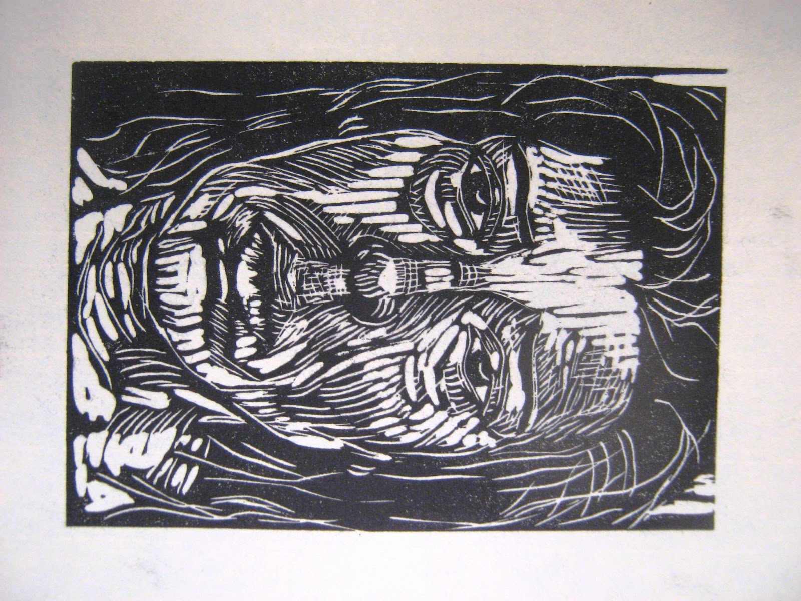
My quest to find the most expensive print in the world, lead me first to Pablo Picasso’s “Le Repas Frugal”, (pictured above) which was a bit of a surprise. I mean, really, this one is nice and all, but I guess I supposed that something by Rembrandt or Durer would claim the top prize. Still, there is something in this piece by Picasso that grabs the viewer. The primordial couple sitting very intimately at a table, looking out at the world, as if they hadn’t a care. The fact this piece comes early in Picasso’s oeuvre, lends some intrigue for the period the work is associated with – namely the carnival and Rose period. The couple’s faces are drawn and their gaze seems detached from the world around them. Their bodies are elongated as one would expect to see if El Greco was alive and working in the 20thc., but they aren’t representing celestial beings, just the average Parisian starving artist.
Then, after more investigation, I discovered there are subcategories to the original print auction records, and low and behold, some other surprising names and pieces popped up. I will give a listing and a sampling of them at the end of this article. More predictably, Rembrandt’s Three Crosses,” a 1653 etching, One impression,( about 80 are known to exist), sold privately a few years ago for $1.5 million. (It's estimable value in 1967 was a mere $20k. Yikes!) Albrecht Durer figures into the same subcategory with his famous "Adam and Eve" print.

Still, moving closer to our own time period, some of the most recent art auction sales for original prints on paper are garnishing staggering sums at auction. Pablo Picasso's “La Femme Qui Pleure I” (pictured here)now claims to the top price paid for a work of art on paper in the print category. A nice little piece, considering the subject is of a wailing woman:)

One Norwegian artist's print has recently risen to the upper levels of the charts and stolen our collective hearts. It's a quiet little color print by the tortured soul Edvard Munch. His "Young Woman on the Beach", done in 1891-92, just sold for a whopping $3.2 million.


Picasso's rival, Henri Matisse, rates the number Two spot for the Impressionist/Modern category with his “Océanie, La Mer”(below). It grandly reflects his latter Joy collage work, without the usual bold colors.
Two artists from the Contemporary category who have done well, one expectantly so, is Andy Warhol. His iconic Marilyn Monroe portrait is on the top-selling list, but it's his Chairman 'Mao" 10 portraits series that has garnished over $2 million in recent sales. They seemed a sort of quirky subject, given Mao wasn't the Iconic American figure like Marilyn was, but in the 1970s, when US President Nixon went to visit the famed leader of the eastern world, it was big news and a significant step toward what became global enterprise.


For a living artist, Jasper Johns has realized a hefty price for one of his prints, "Untitled" from 1983, where this painterly impression brought in $1.5 million in 2012.It's not exactly a favorite of mine, but it easily speaks to John's paintings.

All this fuss about some dried ink on paper, but admit it, they Are treasures in the art world, and they reflect a growing art-savvy collector base. We printmakers can take encouragement from this news, as we all know we’re not giving up the 'ink in our veins idea' that original prints are worth as much as any old bit of oil paint on canvas, or a collage, or even a .... photograph.

Truly, the real thing here to pay attention to is not how Much $ these lovely pieces of paper are Worth. The real importance to any of them is the artist who decided to make an image friom his/her imaginaiton or observations. The real importance is the result we get from seeing these images and the messages they convey to our collective souls. No one auction record could ever mean anything compared to that.

Look over these stats, and chew on those numbers. Just imagine how much paper, plates and ink we could buy with that, eh?

OLD MASTERS
1. Rembrandt van Rijn, “Christ crucified between the two thieves: The Three Crosses” (circa 1660) $990,000 at Doyle New York, May 23, 1990.
2. Rembrandt van Rijn, “Christ Presented to the People: Oblong Plate” (1655)
$956,100 at Christie’s London, December 10, 1991.
3. Rembrandt van Rijn, “Christ Crucified Between the Two Thieves: The Three Crosses” (1653–61) $924,200 at Christie’s London December 5, 2006.
4. Albrecht Durer, “Adam and Eve” (1504) $655,900 at Christie’s London, July 7, 2011.
5. Albrecht Durer, “Map of the Northern Sky and Map of the Southern Sky” (circa 1515)
$577,800

IMPRESSIONIST/MODERN
1. Pablo Picasso, “La Femme Qui Pleure I” (1937) $5,122,500 at Christie’s New York, November 1, 2011.
2. Henri Matisse, “Océanie, La Mer” (1946–47) $4,774,500 at Christie’s London, June 21, 2011.
3. Pablo Picasso, “Le Repas Frugal” (1904) $3,052,400 at Christie’s London, June 20, 2012.
4. Edvard Munch, “Vampire II” (1895–1902)$2,182,800 at Grev Wedels Plass Auksjoner, Oslo, November 27, 2007.
5. Pablo Picasso, “La Minotauromachie” (1935) $1,980,400

CONTEMPORARY
1. Andy Warhol, “Mao” (set of 10 from 1972) $2,544,800 at Sotheby’s London, May 22, 2012.
2. Andy Warhol, “Mao” (set of 10 from 1972) $1,684,900 at Christie’s London, October 16, 2007.
3. Andy Warhol, “Marilyn Monroe” (set of 10 from 1967) $1,551,800 at Christie’s London, June 20, 2007.
4. Jasper Johns, “Untitled” (1983) $1,482,500 at Christie’s, New York, May 9, 2012.
5. Andy Warhol, “Mao” (set of 10 from 1972) $938,500.

Sunday, July 28, 2013

Psst, Here's Where to See the Really Smokin' Prints.....

You know, every once in a while the chance to go see some art in a really great museum comes along, and how often do we actually go? Personally speaking, Not as much as I would like. Sooooo, in an effort to encourage my fellow inked up brethren and sisters to go see some mighty, mighty fine prints, here is a list of the top 22 institutions (western world) whose collections kick collective butt. I am a bit surprised to see that the US only registers 5 out of the group, but hey, there are a few places on the list any printmaker would be pleased to make a pilgrimage to see some dry ink on old paper. So collect the kiddies, students, and colleagues and bypass that over-hyped and over-rated show in Venice this summer and go visit France, UK, Austria, the Netherlands, Spain, Russia and Germany. You'll be glad you did.:)

British Museum, London, UK
50,000 drawings, 2 million prints
The Metropolitan Museum of Art, New York, US
15,000 drawings, 1.5 million prints
Albertina, Vienna, Austria
50,000 drawings, 1 million prints
Excludes 25,000 architectural drawings
Kupferstichkabinett, Berlin, Germany
110,000 drawings, 500,000 prints
State Hermitage, St. Petersburg, Russia
39,000 drawings, 486,000 prints
Victoria & Albert Museum, London, UK
2,000 drawings, 500,000 prints
Excludes 600,000 architectural drawings, 100,000 design drawings and 10,000 British drawings
National Gallery in Prague, Collection of Prints and Drawings, Prague, Czech Republic
60,000 drawings, 400,000 prints
Cabinet des Estampes et des Dessins, Strasbourg, France
200,000 prints and drawings
Fitzwilliam Museum, Cambridge, UK
20,000 drawings, 180,000 prints
Royal Collection, London, UK
40,000 drawings, 150,000 prints
Including 600 drawings by Leonardo da Vinci
Musée du Louvre, Paris, France
140,500 drawings, 43,000 prints
The main print collection is at the Bibliothèque nationale de France.
Philadelphia Museum of Art, Philadelphia, US
150,000 drawings and prints
Uffizi, Florence, Italy
120,000 drawings and prints
Bibliothèque de l'Arsenal, Paris, France
100,000 prints
Art Institute of Chicago, Chicago, US
11,500 drawings, 60,000 prints
Musée des Beaux-Arts, Dijon, France
10, 500 drawings, 60 0000 prints
Musée des Beaux-Arts, Orléans, France
10,000 drawings, 50,000 prints
Museum of Modern Art, New York, US
6,000 drawings, 50,000 prints
Includes more than 4,000 Old Master drawings and excludes over 10,000 architectural drawings
Brooklyn Museum, New York, US
2,000 drawings, 40,000 prints
Museo del Prado, Madrid, Spain
9000 drawings and prints
Zelandia Illustrata, Amsterdam, Netherlands
18,000 maps, prints, drawings, photographs, glass negatives, slides and postcards

Friday, July 26, 2013

Richard Tretault's Engagement with Youth and Passages

Richard Tretault is an artist living in Vancouver, Canada. His career has been spent looking at his surroundings and getting a feel for life on the street.  His fascination with the urban landscape is long-standing, so much so that he often has worked to improve the quality of arts found in an urban setting by working on murals and large-scale projects.  His interest in this area led him to coordinate with the Canadian-based LaRaza, bringing arts to public spaces in Canada, Argentina and Mexico.  


Tretault’s prints have the same feel as his other works, meaning they have an expansiveness, both in actual scale and  the allegorical images they project. The bold brushwork and color of his images show us a person working uninhibited in the medium. He brings forth a liveliness and an underlying pulse of the people living in his environments.

The doorways, or passageways, some broken and falling apart let us equally enter and exit the image. The faces of youth, contrasted against the broken down environment show that youth will always carry on into the future. The strength of his lines, collaged sections and angles harken to the Expressionists, but where he differs from them he allows vibrant and passionate color work push and pull the compositions like a Hans Hoffmann painting.

Tretault's series about Cuba and its culture speak about it enduring struggle to survive in the face of overwhelming societal and governmental sanctions. The strata of their lives in Cuba is fraught with obstacles, yet it is a culture full of music and creativity.Doors are closed tot he outside public, and crows or vultures seems to await those that venture outside its confines, but the birds have nothing to eat, and the doors are alive with within. Nothing will keep them from being the creative, inventive people they are.  
Likewise, Tretault's portraits of Cuban youth amidst broken or cubistically-collaged objects in their environment, like a bicycle or an angel floating overhead(whether figurative or allegorical) it is there watching over them protecting them from evil. They will defiantly stand their ground and fix that broken bicycle or 1950s car as many times as it takes because it's all they have. They will survive because they have to.
. 
This final portrait collages the elements of the Caribbean, the waves, the breeze blowing through the palm trees, and the face of this young man, ever-watching for his opportunity to break free of  the confines of his country. I ascribe my thoughts upon these pieces, but I sense and feel Tretault's warm breezes blowing over the land and the youth's skin. On the surface the place isn't so bad, but the translucency of Tretault's printings underscore hidden feelings and suppressed ambitions. They are strong, powerful compositions that engage us through color and linear details, but we are more fascinated by what is not seen and what is unknown about a culture that as been virtually isolated for 50 years.It's as though Tretault is saying, 'open the gates and let us in', for there is much to discover and much to learn about the arts and people of this little island nation. I hope someone listens to Tretault's images and lets us do just that. http://www.richard-tetrault.ca/

Sunday, July 21, 2013

Taiwan’s LIAO SHIOU-PING : Where East Meets West

LIAO SHIOU-PING was born in Taiwan in 1936, the son of a civil engineer. As a child, he would often study architectural blueprints spread across his father’s desk. His family lived near Taipei’s famous Longshan Temple and it helped formed strong influences upon his artwork.
The name Shiou-Ping Liao is practically synonymous with printmaking in Taiwan. Dedicated to promoting modern Taiwanese printmaking, Liao has made significant contributions to the development of modern printmaking in Taiwan and China. Liao’s art education started at the National Taiwan Normal University. In 1959, he moved to Tokyo, Japan to study at the Tokyo University of Education (now the University of Tsukuba), and then moved to paris France to study at the Fine Arts Institute of Paris, and Atelier 17. He studied painting, graphic design and printmaking. When he was in Paris, one of his instructors pushed him to find his own style, and he began to explore his Asian roots as a source of inspiration. He drew on memories of the candles, incense and ghost money from Longshan Temple for much of his later work. In the late 1960s he loved to New York where he developed his Symbols series, inspired by Taiwanese culture. Liao believed that “an artist’s style reflects the rhythms of the society that he lives in.”
Liao has devoted himself to creative expression and exploration, developing visual art to express the character, customs, faith, and lifestyles of his people. Liao’s work incorporates Asian sensibilities with a strong graphic design. It is work full of personal symbols and rich in Eastern art colors like red, gold and black; describing a longing for harmony, balance and beauty. He has found a way to bridge Eastern and Western ideas, techniques, and formats, creating a series of works of unique symbols which derive from inscriptions on ancient bronze, drawings of antique ceramics, and Chinese religious, folklore art and gates which reflect secular and divine connections.
In the mid 1970s, Liao returned to Taiwan where he bagan to teach at the National Taiwan Normal University. He developed a textbook on printmaking, The Art of Printmaking, which is still the Bible of printmaking techniques in Asia. He later taught in Tokyo and the US. In the 1990s, he spent time in mainland China teaching western printmaking techniques and spreading an enthusiasm for the medium. Liao’s wife unforeseen death in 2002 inspired his Dreams series where he conveys the duality of yin and yang, life and death, through images of outstretched hands and ghost money.
During his career, Liao Shiou-ping has held more than 70 solo exhibitions in New York, Paris, Tokyo and many other cities around the world. His work can be found in the following permanent collections:
The British Museum
The Metropolitan Museum of Art in New York
the National Museum of Modern Art(Tokyo)
Taipei Fine Arts Museum
The Shanghai Museum

Awards:
Recipient of the Nation Cultural Award and National Award for Arts, earning the title of “father of modern Taiwanese printmaking” for his outstanding artistic achievements.
Co-Founder of the Prix de Paris fund to provide support for young artists to study abroad.

Saturday, July 13, 2013

The Fluidity of Ryan McGinness' Semiotics

Ryan McGinness’ prowess in printmaking circles is becoming quite a known entity. His eye-catching, crisp and clean logo-like motifs are complex in their subject and when overlapped or placed next to other motifs, they sometimes create other shapes. The artists’ homage to semiotics and mass-commercialism is apparent, and his works are widely seen in galleries, online sources, and online merchandising. I will, however, speak to his work in this article.


 McGinness is more known as a young, up-coming painter who has received enormous attention for his intricately, over-lapping designs. They can, at times, resemble the complexity of viewing Islamic designs within a majid, or a host ot graffiti-like tattoos, but his subject matter is more far-reaching, incorporating known designs and creating his own logos for religious symbols, the human form and animals, etc. To McGinness, the more exotic his references are, the better.   The end result of these complex combinations is often successful when applied to his paintings, but his prints aren’t as heavily drenched in color nor in subject. Nor do they need be.
He often lets the white of the printed paper show through and around hsi subjects and it creates a shape of its own. Some of his prints don’t appear ‘finished’ - like some of Paul Cezanne’s watercolors left an openness of the paper for the viewer to fill in the gaps. I can’t say I think McGinness is attempting the same dialogue. To be honest, it would appear that his message isn’t even about the subject-ness of his designs and logos. He appropriates form for building other types of shapes, but as for some inner meaning or referential point, McGinness doesn’t mention anything in particular, and their vagueness leaves one detached.  His deliberate avoidance for some compositional device(more seen in his prints) may also be a form of anti art-statement. In some cases, I am reminded of the work of Carrie Plank, whom I wrote about earlier this year. Her sensibility for combining recognizable form was so disparate, that one couldn’t connect the dots of meaning in her work. Here, I am close to making the same assessment with McGinness’ work, although he does control the design of his logos and their uniformity is in his use of their flat, bright colors.
Where McGinness’ paintings are saturated with line and form and visual “POW!” , his prints are just as complex in their single use of color. I, too, understand wanting to try ‘something else’ in other media, so one can see the artist’s thought-process at work.  I do like the artist’s energy and the fact he is seems to be ever-exploring his imagery.

McGinness’ expansion from geometric form to fluid curvilinear motifs moves us through some earlier 20th c. art movements like Op Art and the Semiotics of the 1980s, Multi-culturalism and tattoo-graffiti of the 1990s to now. The multi-ethnic source material will be interesting to see evolve, as it has been with earlier artists’ work, but the ambitious nature of his overall projects and producing them in other cultures speaks to the works of his predecessors Keith Haring and Jean-Michel Basquiat.  We will hope his longevity transcends theirs, as this own path moves forward.

Sunday, July 7, 2013

"All Stars" by Teresa J. Parker debuts at Museo Tecleno MUTE


Greetings to all my inked up comrades.

Pardon my brief online absence as I have been feverishly at work preparing for my first ever museum exhibition. The making of new work is never as arduous as its shipping and anticipated safe arrival to parts far flung. I am pleased to report that four new series of prints and drawings will debut July 12th at the Museo Tecleno MUTE, a suburb of San Salvador, in Santa Tecla. The series for this exhibition are: 1) the ‘Baby Bird Suite’, prints conceived in part from Francisco de Goya's Caprichos prints, about illegal adoptions in Central America, 2) ‘Battered Madonnas’, which debuted in Guatemala in 2012, is about making iconic madonnas out of domestic violence victims, 3) the ‘All Stars’ is a new print series about the growing occurrence of filicide, and 4) ‘Domestic Bliss’ are new drawings tying together the theme of Battered madonnas. Many thanks to my art comrade and friend John Sevigny for including me in this joint exhibition of our works. Sevigny will be showing his now well-known "NOMADS" project, on the subject of migration from Central America through Mexico.

While I am loathe to go into much detail about my own work, I am posting this new project here for your review. (Warning* The subject of this series may be difficult for some readers.)

The ‘All Stars’ project came about as an extension of my long-standing theme relating to women and children. My earlier series, the Battered Madonnas, previously shown in Guatemala and Mexico, discusses in visual form the physical and spiritual scars of domestic violence - a topic not much discussed. My current project “All Stars” also crosses a bridge not often discussed, except in hushed tones and to make one shudder. Filicide is a growing phenomenon, and the alarming number of occurrences in the United States alone is staggering and heart-breaking. It’s a subject I don’t pretend to understand, nor condone, but as a mother and an artist, I feel I must make a statement. The exhibition contains twelve portraits of women charged and convicted of filicide, although I am only displaying ten here.

The nature of madonnas(young mothers) and matriarchs is to nurture and care for their children and their extended families. It is a natural and sacred responsibility that has been in place since the dawn of humankind. Yet, as present global events and situations take their emotional, physical and spiritual toll upon men and women, something essentially human is breaking down. The nature of familial units separate, grow distant and sometimes break apart. No one can conceive how a mother could take the life of her child, but it does happen, and the reasons are varied. This series is a structural look at the faces of these women and caregivers. There is no one thing that speaks to their individual circumstances, rather I chose in these prints to de-personify these subjects, to look at them as objects, yet elements of their personalities came through. I will let you view them without further comment, but it is hoped that you will share your impressions with your colleagues, family and friends.

Friday, June 14, 2013

John Abell Explores Gallows Humor on Love and Life


British artist John Abell is making a splash with his large scale relief prints.These mega-inked up babies  bring with them a microcosm of art historical references which allows the viewer to move through late 19th c. early 20th c image-making. Abell's interest to make the image a life-sized scale is not  a purposeful decision as much as it is opportunity.  You see, he uses available materials. The scale of the piece is the scale of the matrix. Plain and simple. The guy doesn't believe in wasting useful printing surfaces. Gotta love him for that. (Face it, most printmakers are a resourceful lot, and we've all re-used matrixes before.)
Abell maximizes his whole picture plane, and one finds fractured scenes with main characters and subplots, as one would find in a novel. His descriptions of love and sacrifice, of losing on'e head(quite literally cut off) from one's body is a little ghoulish, but meant in good humor. We all lose our heads when we're in love, or in fascination. As figures pine away for their beloveds, or stare at us complacently with their limbs detached and lying about, one ponders the sense of emotional or real pain one suffers in the course of a day or a life. 

The physical carvings or wounds upon  Abells' matrix  compliment the subject well. His references to the works of German Expressionist printmakers is clear, but he fills up the pictures with lots of flowing rivers - of blood, perhaps, for the work is in black and white, and if presented in color, might seem overpowering or repulsive. The animated quality the work retains lets us look endlessly through the compositions and want to touch their printed paper surfaces. 


Complicated passages of people passing through time, lost love, childbirth and impending death weave seamlessly together. We are curious where these subjects come from, but there is a whole history of cartoonish gallows humor. These are less cartoon-like, but harken back to more medieval times, where a 'how to be a good christian' prophesy and faith were more intertwined in one's daily existence. They are refreshingly simple, yet complex, and encourage us to break with printmaker's traditional scale to produce images we feel we can walk into.Bravo!

Abell pictured below printing an image in his apartment.
johnabell.blogspot.com/‎