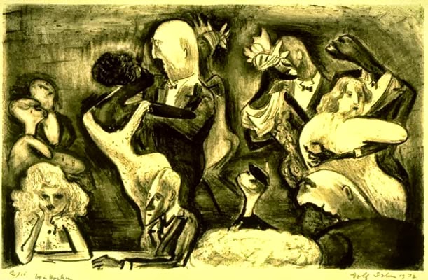
All my fine inked up friends who are enduring the winter in the globe's northern extremities, take a look to the small, yet tourist-popular Caribbean island group of nations called The Bahamas. It is there that our next artist profile will focus attention on the fine work being done by John Edward Cox; a young artist and teacher making big waves duking out his multi-media work, and who is rapidly paving the way for a new generation of Bahamian artists.
John Edward Cox (b. 1973, Nassau, The Bahamas) has been able to build an artistic/cultural bridge between the outside world and the relatively isolated place of his birth. Cox has pushed himself to transcend the oh so predictable Caribbean tourist-driven art markets to produce artwork which speaks beyond the historically isolated imagery of his Bahamian colleagues. His work is reaching beyond those water-bound confines to address current art/cultural sensational trends which is seen in Europe with the work of Damien Hirst(although Cox's work is far superior), and the United states with Warholian relish for graphically-universal images.
Cox was born in The Bahamas at the same time it achieved Commonwealth status from Great Britain. In the early 1990s, he attended the Rhode Island School of Design where he soon discovered his passion for illustration, receiving his BFA in Illustration, then an MAT in Art Education. Cox returned to the Bahamas to teach at the Art Department of The College of the Bahamas, where he still works today. In addition, Cox has worked at The National Art Gallery of the Bahamas in their Education Department.
He opened Popop Studios in Nassau, a place that is both studio and gallery where he creates mixed media pieces and abstract furniture design. Popopstudios International Center For The Visual Arts is a prolific gallery and has an Artists in Residence program with 8-10 artists participating at any given time. For more information about their program, or to apply for a residency, go to http://www.popopstudios.com
Cox has established himself as a distinguished printmaker, having exhibited and participated in several international exchanges in France, Italy, Germany, Hong Kong, the United States and the Caribbean. His works focus on taking ideas already existing in the mass media and bringing attention to them in the same manner as Andy Warhol or England's Ryan McGinnis, although he doesn't make these images symbolic of a condition a global symbol. They are, for the most part, uplifting works to encourage and inspire his fellow man in the lifelong game of one's survival. Some of the boxer series have an affinity with ancient Aegean boxer frescoes found in Crete(another island nation who enjoyed their sports), but his images are rooted in graphic illustrations of boxing promotional posters as found in the 20th century.
Cox is known for producing large-scale works, incorporating multiple media and non-traditional printmaking techniques, to achieve his goals. There is a flat, patterned look of his printed work, at once making the mythic struggle of two men engrossed in battle something timeless, but it also sneaks a punch into a microcosm of the Bahamas' participation in the slave industry of the 17th-18th c. Cox presents an undertone to us, via an updated and popular sport, of an eternal search for dominance and one's struggle to survive. This print contender is set to go the distance, my friends. Be sure to grab a ticket to his next [art]bout.
Exhibitions
The Central Bank of The Bahamas Gallery
Chasama Art Center, New York
Diaspora Vibe Gallery, Miami, for Art Basel
National Art Gallery of the Bahamas, Nassau, Bahamas
New Providence Community Centre Gallery, Nassau, Bahamas
Popop Studios/Gallery, Nassau, Bahamas
"Urban Life in the Caribbean" - Traveling Exhibition
Santa Domingo, Puerto Rico, Guyana & St. Kitts
Education
MAT Rhode Island School Of Design, Providence, RI
BFA Rhode Island School Of Design, Providence, RI
Contact
Tel: 242.322.7834
Email: iamjohncox@gmail.com
Web: www.popopstudios.com
A place for talking about art, social issues, and most anything else I think THAT'S INKED UP.
Sunday, December 1, 2013
Monday, November 25, 2013
Ecuador's Galo Galecio: A Printmaker of the People
The name Galo Galecio Taranto (1906 - 1993) is important in Ecuadoran art circles, although he didn’t receive much notoriety outside of his homeland. He was, however, a renowned painter, sculptor, caricaturist and, for the purposes of this article, an amazingly wonderful printmaker. Unfortunately, I have only been able to find a scant amount of information about this artist, but his images will compensate for whatever text may be lacking.
After studying at the School of Fine Arts in Guayaquil with the Spanish artist José María Roura Oxandaberro (1925-1930), Galecio received a scholarship from the Ministry of Education to make a specialized study of printmaking and mural painting at the National Academy of Fine Arts in Mexico (from 1944-1946). It was there that he studied with the famous muralist Diego Rivera, and became friends with David Alfaro Siqueiros. He also became a member of the famous printmaking workshop, Taller de Gráfica Popular and he studied printmaking.
One of Galecio’s first print portfolios was ‘Bajo la Linea del Ecuador’, which became one of his most important works. It was a portfolio created in 1946, comprised of 31 images, which depicted tropical landscape scenes of village life from Ecuador’s coastal towns. He used the tropical landscape as a backdrop to show the living and working conditions of his countrymen, whom he felt had been forgotten.
Galecio's prints are direct and forceful. There is also a sort of dreamy quality in them, as only someone who knows life in the tropics could understand. He created poignant life portraits, full of sentiment and expressive gesture. He captures the strength, perseverance and spirit of the hardworking, suffering people of his Ecuadorian land, particularly the indigenous and black portion of the population. Their daily grind to work the fields and fish the sea, bring products to market and toil under the hot sun isn't glamorized any more than the works of the French working class that Courbet and Millais strove to make real in the 19th century. Galecio's simple and somber tone, as found in the faces of the people in the last image of this article, bear their life's struggle that was prevalent in Ecuador.
The force of his images makes Galecio one of the greatest Expressionist and Realist artists in Ecuador from the 1930s to 1950s. In 1987, Galecio was awarded Ecuador's most prestigious prize "Premio Eugenio Espejo" for his lifetime’s achievement in the arts.
Galecio’s work is included in numerous international collections, including three color prints in the Museum of Modern Art, NY.
After studying at the School of Fine Arts in Guayaquil with the Spanish artist José María Roura Oxandaberro (1925-1930), Galecio received a scholarship from the Ministry of Education to make a specialized study of printmaking and mural painting at the National Academy of Fine Arts in Mexico (from 1944-1946). It was there that he studied with the famous muralist Diego Rivera, and became friends with David Alfaro Siqueiros. He also became a member of the famous printmaking workshop, Taller de Gráfica Popular and he studied printmaking.
One of Galecio’s first print portfolios was ‘Bajo la Linea del Ecuador’, which became one of his most important works. It was a portfolio created in 1946, comprised of 31 images, which depicted tropical landscape scenes of village life from Ecuador’s coastal towns. He used the tropical landscape as a backdrop to show the living and working conditions of his countrymen, whom he felt had been forgotten.
Galecio's prints are direct and forceful. There is also a sort of dreamy quality in them, as only someone who knows life in the tropics could understand. He created poignant life portraits, full of sentiment and expressive gesture. He captures the strength, perseverance and spirit of the hardworking, suffering people of his Ecuadorian land, particularly the indigenous and black portion of the population. Their daily grind to work the fields and fish the sea, bring products to market and toil under the hot sun isn't glamorized any more than the works of the French working class that Courbet and Millais strove to make real in the 19th century. Galecio's simple and somber tone, as found in the faces of the people in the last image of this article, bear their life's struggle that was prevalent in Ecuador.
The force of his images makes Galecio one of the greatest Expressionist and Realist artists in Ecuador from the 1930s to 1950s. In 1987, Galecio was awarded Ecuador's most prestigious prize "Premio Eugenio Espejo" for his lifetime’s achievement in the arts.
Galecio’s work is included in numerous international collections, including three color prints in the Museum of Modern Art, NY.
Thursday, November 21, 2013
Antoni Clave: To the Print Victor
Antoni Clavé (1913 – 2005) whose career spanned all plastic art forms, and whose designs were also nominated for two Academy Awards, was one of Spain’s most celebrated artists.
He briefly studied at Escuela de Artes y Oficios in Barcelona, and then went to work at a design firm called Cinaes, designing cinema posters. Additionally, he worked for a children's magazine and designed advertising posters. During the Spanish Civil War, Clavé was a draughtsman for the Republican government but emigrated to France at the end of the war. He was sent to an internment camp at Les Haras camp in Perpignan. Clavé then settled in Paris in 1939, drawing comics and working as an illustrator.
In the 1940s Clavé's painting style became visibly influenced by the works of painters and printmakers like Bonnard, Vuillard, Rouault and Picasso, whom he met in 1944. He split his time between the fine arts and design for much of his career, but in the 1950s he devoted himself to painting. His work at that time became more abstract and enigmatic; inspired by graffiti and collaging with newspaper and other textures. Three years later Clavé was designing carpets and in the 1960s he also did bas reliefs, assemblages and wood sculptures.
Clave’s stylistic sensibility began with a sort of lyrical abstraction and it moved toward a pure, minimal format. In the early 1980s Clavé created a series called "Hommage à Picasso”. Clavé's images were scenes of melancholic, yet tranquil domesticity, strangely child-like figures, with the odd clown/harlequin thrown in for good measure. The influence of Picasso and Rouault is most prevalent, and he effectively uses overlays of rich color to create beautifully textured works.
On the flipside of his career, Clave’s theatrical designs appeared on stages worldwide, as well as in numerous films. His works include sets for opera, theater, and ballet, most notably for Roland Petit's ballet company, including Carmen (1949). From 1946 Clavé did numerous designs for ballet and theatre in Paris, Munich, London and New York; in the 1950s he turned to book illustration. In 1952 his work in film was nominated for two Academy Awards (Best Art Direction and Best Costume Design) for Hans Christian Andersen.
In 1965 Clavé moved to the South of France, near Saint-Tropez where he lived the rest of his life. The grab-ya of Clave’s work is that instant visual connection with the work of his friend Picasso, yet Clave’s images have more density, more richness, whereas we see in Picasso’s work the speed and fury of that artist’s brush. The story of the tortoise and the hare come to mind when comparing the two artists, and to my mind Clave is clearly the victor. For all of you collectors out there, Clave’s work is reasonably priced and you’d do well to get a few of his prints while they are still plentiful.
His work is displayed in many museums, including:
Several one-man shows in museums and galleries in Zurich, Barcelona, Paris and Tokyo
The British Museum, London
1978 Centre Pompidou Musée d'Art Moderne, Paris
Fine Arts Museum of San Francisco
Museo de Bellas Artes de Bilbao
Museo Nacional de Arte Reina Sofia, Madrid
Museum of Modern Art, Paris
Museo Patio Herreriano de Valladolid, Spain
National Museum of Serbia
Tate Gallery, London
1984 Venice Biennale Spanish pavilion was dedicated to Clavé
He briefly studied at Escuela de Artes y Oficios in Barcelona, and then went to work at a design firm called Cinaes, designing cinema posters. Additionally, he worked for a children's magazine and designed advertising posters. During the Spanish Civil War, Clavé was a draughtsman for the Republican government but emigrated to France at the end of the war. He was sent to an internment camp at Les Haras camp in Perpignan. Clavé then settled in Paris in 1939, drawing comics and working as an illustrator.
In the 1940s Clavé's painting style became visibly influenced by the works of painters and printmakers like Bonnard, Vuillard, Rouault and Picasso, whom he met in 1944. He split his time between the fine arts and design for much of his career, but in the 1950s he devoted himself to painting. His work at that time became more abstract and enigmatic; inspired by graffiti and collaging with newspaper and other textures. Three years later Clavé was designing carpets and in the 1960s he also did bas reliefs, assemblages and wood sculptures.
Clave’s stylistic sensibility began with a sort of lyrical abstraction and it moved toward a pure, minimal format. In the early 1980s Clavé created a series called "Hommage à Picasso”. Clavé's images were scenes of melancholic, yet tranquil domesticity, strangely child-like figures, with the odd clown/harlequin thrown in for good measure. The influence of Picasso and Rouault is most prevalent, and he effectively uses overlays of rich color to create beautifully textured works.
On the flipside of his career, Clave’s theatrical designs appeared on stages worldwide, as well as in numerous films. His works include sets for opera, theater, and ballet, most notably for Roland Petit's ballet company, including Carmen (1949). From 1946 Clavé did numerous designs for ballet and theatre in Paris, Munich, London and New York; in the 1950s he turned to book illustration. In 1952 his work in film was nominated for two Academy Awards (Best Art Direction and Best Costume Design) for Hans Christian Andersen.
In 1965 Clavé moved to the South of France, near Saint-Tropez where he lived the rest of his life. The grab-ya of Clave’s work is that instant visual connection with the work of his friend Picasso, yet Clave’s images have more density, more richness, whereas we see in Picasso’s work the speed and fury of that artist’s brush. The story of the tortoise and the hare come to mind when comparing the two artists, and to my mind Clave is clearly the victor. For all of you collectors out there, Clave’s work is reasonably priced and you’d do well to get a few of his prints while they are still plentiful.
His work is displayed in many museums, including:
Several one-man shows in museums and galleries in Zurich, Barcelona, Paris and Tokyo
The British Museum, London
1978 Centre Pompidou Musée d'Art Moderne, Paris
Fine Arts Museum of San Francisco
Museo de Bellas Artes de Bilbao
Museo Nacional de Arte Reina Sofia, Madrid
Museum of Modern Art, Paris
Museo Patio Herreriano de Valladolid, Spain
National Museum of Serbia
Tate Gallery, London
1984 Venice Biennale Spanish pavilion was dedicated to Clavé
Labels:
Academy Awards,
Bonnard,
Hans Christian Andersen,
Picasso,
Vuillard
Saturday, November 16, 2013
Happy (?) Jamaican Slaves via the Prints of Isaac Mendes Belisario
Isaac Mendes Belisario (1795-1849), has been described as the first documented Jamaican artist, but he was raised for a time in London, studied art and then worked as a stockbroker before returning Kingston, Jamaica, (a British colony) in the early 1830s. He became a well-known artist, painting landscapes and state portraits of important colonial residents, but he also made prints about the island’s local slave population. His work provides a rich description of Jamaican life at the time of the Emancipation, and while some of his observations seem one-sided according to today’s state of political correctness, they do enlighten us about slaves’ daily activities, and celebrations.
Belisario was a member of the Sephardic Jewish merchant class, who worked in retail, wholesaling, and dealt in the country’s slave trade. In 1831, Jamaica’s Assembly proclaimed the Jewish Emancipation Act, which allowed great freedoms for Jews versus the more restricted existence in London. One of Belisario’s distant relatives was briefly imprisoned by the Spanish Inquisition in 1656, before escaping to London. The other side of his family were in the opera and performed for the King of Spain. Another relative, Isaac’s uncle Jacob, was an art dealer, stockbroker and participant in a huge embezzlement scheme of the day.
Born in Kingston in 1794, Belisario was named after his grandfather, the Rabbi Isaac Mendes Belisario (1719-1791), of the Bevis Marks Synagogue in London. One of the Rabbi's sons, Abraham Mendes Belisario came to Jamaica in 1786 where he was employed by Alexandre Lindo, who was one of the wealthiest Jews on the island. Abraham married Alexandre's daughter, Esther, and he was made a partner in Lindo's business, When faced with bankruptcy, Isaac Mendes Belisario's father left his family in London, looked for a job and soon found himself in the West Indies, in Tortola, where he became the manager of seven sugar plantations. He was horrified to see how cruelly the slaves were treated and eventually served on a jury of the first white man brought up on murder charges for killing a slave in Tortola. He wrote an unsuccessful report calling for protection for the treatment of Africans in the West Indies. In addition, the artist’s maternal grandfather was involved in the finances of the Haitian revolution.
In 1837-38, Belisario made a series of hand-colored prints based on a holiday carnival practiced for decades by slaves, called " Sketches of Character In Illustration of the Habits, Occupation and Costume of the Negro Population in the Island of Jamaica " they were accompanied with detailed ethnographic texts. Although slavery was abolished in Jamaica in 1833, these prints were very telling about the perception of the lives of slaves, both before and after emancipation, and they are still very popular in Jamaica.
In tracing the West African roots of Jonkonnu and its evolution in Jamaica, it had its origins with Jon Konny, a celebrated Nzema chief who ruled over Prince's Town in the 17th and 18th centuries in what is now Ghana. The Jonkonnu masquerades became very elaborate, as they incorporated the traditions of other African peoples and even some European carnival traditions. If anything, Jonkonnu was a leveller of slave society where the great Jamaican houses were opened up to the slaves who "drank with their masters and spoke with greater familiarity"; the distance between them briefly forgotten.
All the images represent happy, smiling slaves, well-dressed in theatre European style costumes with fancy wigs and jewelry. He felt the power of these fascinating carnival scenes of slaves. Some of these parades and competitions borrowed from Shakespeare characters. In a blend of carnival and east African dance traditions, the "Jack-in-Green" image at the bottom of this article, we find a barefoot figure in the center of the image, where an initiate’s body is completely hidden by a mask on its face and long vegetable fibers cover the body. Black women in European costumes dance about the covered figure like moths to a flame. Belisario also includes in these images a masked dancer, John Canoe, who was a chief of the village in the Gulf of Guinea, working in the 1720s.
Isaac M. Belisario was not a well man; suffering from tuberculosis. He seems to have never married; nor had any children, although he still has collateral descendents in Jamaica and Australia. His last documented print was produced in 1846, and he is known to have died in London three years later. A book about this artist’s enthralling past has recently been published.
Exhibitions:
Royal Academy
the Society for Painters in Oils and Water-Colours
His prints were produced working with the French printmaker Adolphe Duperly.
Belisario was a member of the Sephardic Jewish merchant class, who worked in retail, wholesaling, and dealt in the country’s slave trade. In 1831, Jamaica’s Assembly proclaimed the Jewish Emancipation Act, which allowed great freedoms for Jews versus the more restricted existence in London. One of Belisario’s distant relatives was briefly imprisoned by the Spanish Inquisition in 1656, before escaping to London. The other side of his family were in the opera and performed for the King of Spain. Another relative, Isaac’s uncle Jacob, was an art dealer, stockbroker and participant in a huge embezzlement scheme of the day.
Born in Kingston in 1794, Belisario was named after his grandfather, the Rabbi Isaac Mendes Belisario (1719-1791), of the Bevis Marks Synagogue in London. One of the Rabbi's sons, Abraham Mendes Belisario came to Jamaica in 1786 where he was employed by Alexandre Lindo, who was one of the wealthiest Jews on the island. Abraham married Alexandre's daughter, Esther, and he was made a partner in Lindo's business, When faced with bankruptcy, Isaac Mendes Belisario's father left his family in London, looked for a job and soon found himself in the West Indies, in Tortola, where he became the manager of seven sugar plantations. He was horrified to see how cruelly the slaves were treated and eventually served on a jury of the first white man brought up on murder charges for killing a slave in Tortola. He wrote an unsuccessful report calling for protection for the treatment of Africans in the West Indies. In addition, the artist’s maternal grandfather was involved in the finances of the Haitian revolution.
In 1837-38, Belisario made a series of hand-colored prints based on a holiday carnival practiced for decades by slaves, called " Sketches of Character In Illustration of the Habits, Occupation and Costume of the Negro Population in the Island of Jamaica " they were accompanied with detailed ethnographic texts. Although slavery was abolished in Jamaica in 1833, these prints were very telling about the perception of the lives of slaves, both before and after emancipation, and they are still very popular in Jamaica.
In tracing the West African roots of Jonkonnu and its evolution in Jamaica, it had its origins with Jon Konny, a celebrated Nzema chief who ruled over Prince's Town in the 17th and 18th centuries in what is now Ghana. The Jonkonnu masquerades became very elaborate, as they incorporated the traditions of other African peoples and even some European carnival traditions. If anything, Jonkonnu was a leveller of slave society where the great Jamaican houses were opened up to the slaves who "drank with their masters and spoke with greater familiarity"; the distance between them briefly forgotten.
All the images represent happy, smiling slaves, well-dressed in theatre European style costumes with fancy wigs and jewelry. He felt the power of these fascinating carnival scenes of slaves. Some of these parades and competitions borrowed from Shakespeare characters. In a blend of carnival and east African dance traditions, the "Jack-in-Green" image at the bottom of this article, we find a barefoot figure in the center of the image, where an initiate’s body is completely hidden by a mask on its face and long vegetable fibers cover the body. Black women in European costumes dance about the covered figure like moths to a flame. Belisario also includes in these images a masked dancer, John Canoe, who was a chief of the village in the Gulf of Guinea, working in the 1720s.
Isaac M. Belisario was not a well man; suffering from tuberculosis. He seems to have never married; nor had any children, although he still has collateral descendents in Jamaica and Australia. His last documented print was produced in 1846, and he is known to have died in London three years later. A book about this artist’s enthralling past has recently been published.
Exhibitions:
Royal Academy
the Society for Painters in Oils and Water-Colours
His prints were produced working with the French printmaker Adolphe Duperly.
Labels:
Adolphe Duperly,
Jamaica,
John Canoe,
Jonkonnu,
Sephardic Jews,
slavery
Monday, November 11, 2013
Josef Albers' Fetish for A Colored Square: Prints
The teachings of Josef Albers are legendary in art education circles, but his work in color theory and design is equally important. Born in Germany to a family of craftsmen, Josef Albers (1888 – 1976) worked in furniture and glass before teaching painting and engaging hords of students eager to have the opportunity to work with the famed educator. His work in printmaking was brought to my attention via my mentor and teacher, Robert Wolfe. We were encouraged to do hundreds of color studies abeit in the manner of Albers and try to understand the delicate balances of color in our own works. I didn’t claim to take to Albers ideas at the time, but eventually I saw, as have thousands, his pain-staking research advanced ideas on color and design.
At the age of 20, Albers taught school in his home town, then he went to Berlin to study art education at the Königliche Kunstschule, (1913-1915). For three years, 1916-1919, he began to make prints at Essen’s Kunstgewerbschule, and in 1919 he went to Munich, Germany, to study with Max Doerner and Franz Stuck at the Königliche Bayerische Akademie der Bildenden Kunst.(Try saying that five times fast. See, you can't do it.)

Albers enrolled at the prestigious Weimar Bauhaus in 1920. He joined the faculty of the Bauhaus two years later. The director and founder of the Bauhaus, Walter Gropius, asked him to teach Design to introduce principles of handicrafts. In 1925, Albers was promoted to professor, the same year the Bauhaus moved to Dessau. He also married one of the school’s students, Anni Fleischmann, who would become well-known for her own textiles designs. Albers was teaching with Oskar Schlemmer, Wassily Kandinsky, and Paul Klee. Klee and Albers collaborated in glass and crafts for several years. Under pressure from the Nazi party, the Bauhaus closed in 1933 and most of its artists left Germany. Albers then emigrated to the United States.
The famed architect Philip Johnson arranged a position for Albers as head of a new art school in North Carolina, called Black Mountain College. He led its painting program until 1949. Some of Albers’ notable students were Ray Johnson, Robert Rauschenberg, Cy Twombly, and Susan Weil. He also invited Willem de Kooning, to teach in the summer session. During this period, Albers produced many woodcuts.
In 1950, Albers left Black Mountain to head Yale University’s department of design. While there, Albers worked to expand their graphic arts program. Some of his notable students were Hal Rogoff, Richard Anuszkiewicz and Eva Hesse. He retired from teaching in 1958.
In 1962, as a fellow at Yale, he received a grant from the Graham Foundation for an exhibit and lecture on his work. Also, he worked on his structural constellation pieces. In 1963, he published Interaction of Color which presented his theory that colors were governed by an internal and deceptive logic. Also during this time, he designed abstract album covers. He was elected a Fellow of the American Academy of Arts and Sciences in 1973. Albers lived in New Haven the rest of his life with his wife until his death in 1976.
Albers is best remembered for his work as an abstract painter and theorist. Most famous of all are the hundreds of paintings and prints that make up the series, Homage to the Square. This series, begun in 1949, explored color interactions within square formats. Each piece consists of either three or four squares of solid planes of color sitting atop one another.
His work represents a transition between traditional European art and the new American art. It incorporated European influences from the Constructivists and the Bauhaus movement, but his influence fell heavily on American artists of the late 1950s and the 1960s. "Hard-edge" abstract painters like Frank Stella, Op artists, conceptual artists and even the Abstract artists Mark Rothko and Ad Reinhardt couldn’t help but be influenced by his optical studies. Even the noted artist Robert Rauschenberg admitted Albers was one of his most important teachers.
Albers’ prints draw completely from his painting color studies, although his play with surface and opacity stretched some of his concepts. The prints also have some variety of form and composition, most being hard-edged and clean-looking. There is more spatial depth in his prints than the paintings and the influence of his wife’s designs seems apparent.
The Josef Albers papers, 1929-1970, were donated to the Smithsonian Institution's Archives of American Art in 1969 and 1970. In 1971, Albers founded the Josef and Anni Albers Foundation, a nonprofit organization he hoped would further "the revelation and evocation of vision through art."
Currently, a large part of his estate is held by the Josef Albers Museum in Bottrop, Germany.
Exhibitions
J. B. Neumann’s New Art Circle, 1936
documenta I,1955
documenta IV , 1968
Museum of Modern Art, traveling South America, Mexico, and the US, 1965 - 1967
Metropolitan Museum of Art , 1971
Pinakothek der Moderne, Munich, 2010
Centre Pompidou, Paris
The Morgan Library & Museum, NY
At the age of 20, Albers taught school in his home town, then he went to Berlin to study art education at the Königliche Kunstschule, (1913-1915). For three years, 1916-1919, he began to make prints at Essen’s Kunstgewerbschule, and in 1919 he went to Munich, Germany, to study with Max Doerner and Franz Stuck at the Königliche Bayerische Akademie der Bildenden Kunst.(Try saying that five times fast. See, you can't do it.)

Albers enrolled at the prestigious Weimar Bauhaus in 1920. He joined the faculty of the Bauhaus two years later. The director and founder of the Bauhaus, Walter Gropius, asked him to teach Design to introduce principles of handicrafts. In 1925, Albers was promoted to professor, the same year the Bauhaus moved to Dessau. He also married one of the school’s students, Anni Fleischmann, who would become well-known for her own textiles designs. Albers was teaching with Oskar Schlemmer, Wassily Kandinsky, and Paul Klee. Klee and Albers collaborated in glass and crafts for several years. Under pressure from the Nazi party, the Bauhaus closed in 1933 and most of its artists left Germany. Albers then emigrated to the United States.
The famed architect Philip Johnson arranged a position for Albers as head of a new art school in North Carolina, called Black Mountain College. He led its painting program until 1949. Some of Albers’ notable students were Ray Johnson, Robert Rauschenberg, Cy Twombly, and Susan Weil. He also invited Willem de Kooning, to teach in the summer session. During this period, Albers produced many woodcuts.
In 1950, Albers left Black Mountain to head Yale University’s department of design. While there, Albers worked to expand their graphic arts program. Some of his notable students were Hal Rogoff, Richard Anuszkiewicz and Eva Hesse. He retired from teaching in 1958.
In 1962, as a fellow at Yale, he received a grant from the Graham Foundation for an exhibit and lecture on his work. Also, he worked on his structural constellation pieces. In 1963, he published Interaction of Color which presented his theory that colors were governed by an internal and deceptive logic. Also during this time, he designed abstract album covers. He was elected a Fellow of the American Academy of Arts and Sciences in 1973. Albers lived in New Haven the rest of his life with his wife until his death in 1976.
Albers is best remembered for his work as an abstract painter and theorist. Most famous of all are the hundreds of paintings and prints that make up the series, Homage to the Square. This series, begun in 1949, explored color interactions within square formats. Each piece consists of either three or four squares of solid planes of color sitting atop one another.
His work represents a transition between traditional European art and the new American art. It incorporated European influences from the Constructivists and the Bauhaus movement, but his influence fell heavily on American artists of the late 1950s and the 1960s. "Hard-edge" abstract painters like Frank Stella, Op artists, conceptual artists and even the Abstract artists Mark Rothko and Ad Reinhardt couldn’t help but be influenced by his optical studies. Even the noted artist Robert Rauschenberg admitted Albers was one of his most important teachers.
Albers’ prints draw completely from his painting color studies, although his play with surface and opacity stretched some of his concepts. The prints also have some variety of form and composition, most being hard-edged and clean-looking. There is more spatial depth in his prints than the paintings and the influence of his wife’s designs seems apparent.
The Josef Albers papers, 1929-1970, were donated to the Smithsonian Institution's Archives of American Art in 1969 and 1970. In 1971, Albers founded the Josef and Anni Albers Foundation, a nonprofit organization he hoped would further "the revelation and evocation of vision through art."
Currently, a large part of his estate is held by the Josef Albers Museum in Bottrop, Germany.
Exhibitions
J. B. Neumann’s New Art Circle, 1936
documenta I,1955
documenta IV , 1968
Museum of Modern Art, traveling South America, Mexico, and the US, 1965 - 1967
Metropolitan Museum of Art , 1971
Pinakothek der Moderne, Munich, 2010
Centre Pompidou, Paris
The Morgan Library & Museum, NY
Tuesday, October 22, 2013
Adolph Dehn: The American Regionalist Gone Wild
Noted American printmaker Adolf Dehn was a two-time recipient of the prestigious Guggenheim Fellowship, and he became one of the most important American printmakers of the 20th century. Throughout his artistic career, Dehn participated in the American Regionalism, Social Realism, and Caricature art movements. He began creating artwork at the age of six and by the time of his death, he had created an impressive body of over 600 prints! Imagine my surprise to find this very 'well-known' artist of the mid 20thc. - all but forgotten. Hopefully, this article will bring renewed interest in Dehn's work, and a new group of devotees. I, for one, am sold.
Biography
Dehn was born in Waterville, Minnesota, 1895 and died in New York City, 1968. His mother was a feminist, liberal, socialist member of the German Lutheran Evangelical Church and his father was an atheist and anarchist. Dehn went to the Minneapolis School of Art, then earned a scholarship to the Art Students League of New York. It would serve as a launching point for his career which would take him on travels around the globe and bring him fame and success.
In 1920 Dehn was introduced to printmaking by George Miller and Boardman Robinson. While in New York, Dehn threw himself into liberal politics.
After graduation, he was drafted to serve in World War I, but as a conscientious objector, Dehn refused to serve in the military and he was imprisoned for two years, spending four months in a boot camp in Spartanburg, SC, and eight months as a volunteer art instructor teacher at a hospital for war victims in Asheville, NC.
During the 1920s, after the war was over, Dehn spent eight years in Europe and got a reputation as a satirical printmaker. (In Paris, where he made lithographs at the Atelier Desjobert.) His subjects ranged from social satire to naturalistic landscapes. His cabaret, park scenes, burlesque and scenes of Europe's roaring 20's contrasted against his Midwest regional-looking landscapes, but he wisely used them as a means for selling when he established his own print club during the Great Depression. A number of his caricatures appeared in Vanity Fair.It was in Paris that Dehn met his first wife, Mura Ziperovitch, a Russian dancer who had left the Soviet Union.In 1929 he and his wife returned to the New York, but the country's economic depression made their financial hardships too much to bear, and ultimately contributed to their divorce. In the 1930s, Dehn's work began to appear in the New Yorker and Vogue. He earned a Guggenheim Fellowship in 1939, which allowed him to travel to the western United States and Mexico. Dehn met his second wife, Virginia Engleman, (also an artist) when he participated with the American Artists Group, and they worked as artists for the rest of their lives. From 1938 to 1939 he taught at Stephens College in Columbia, MO. In 1940, he became a summer instructor at the Colorado Springs Fine Arts Center. taught printmaking to other American artists.
As he became more widely recognized and financially successful, Dehn traveled to Key West, Venezuela, Cuba, Haiti, Afghanistan, India and other countries.
Adolf Dehn is considered a prolific artist of great range. His works are found in over 100 museum permanent collections, including the Smithsonian Institute. Dehn’s breadth of work represents printmaking’s victory in the mid 20th century, and he was one of the most important artists in the American Regionalism/American Modernism movements. Thank goodness I found this man's work. I hope this brings some inspiration to others in their own artistic paths.
Exhibited
American Institute of Graphic Arts
American Printmakers Annual
Art Institute of Chicago
Boston Museum of Fine Arts
Cleveland Museum of Art
Knoedler Gallery
Minneapolis Institute of Art
Museum of Modern Art
National University, Mexico
New York Public Library
Newark Public Library
Salons of America
Society of American Painters, Sculptors and Gravers
Weyhe Gallery, NY
Whitney Museum of American Art, 1933-1962
Permanent Collections
Arizona State University Art Museum
Brooklyn Museum of Art
Buffalo Art Center, Cody, WY
Butler Institute of American Art
Colorado Springs Fine Arts Center
Cummer Museum of Art and Gardens, Jacksonville, FL
Denver Art Museum
Edwin Ulrich Museum of Art, Wichita State University, Wichita, KS
John and Mable Ringling Museum of Art, Sarasota, FL
Metropolitan Museum of Art
Michael C. Carlos Museum, Emory University, Atlanta, GA
Minneapolis Institute of Arts
Mount Olive College – Moye Library, Mount Olive, NC
Museum of Art at Brigham Young University
Museum of Modern Art
Nelson-Atkins Museum of Art, Kansas City, MO
Newark Museum
Norton Museum of Art, West Palm Beach, FL
Paine Art Center, Oshkosh, WI
Parrish Art Museum, Southampton, NY
Pennsylvania Academy of Fine Art
The Phillips Collection
Phoenix Art Museum
Robert Hull Fleming Museum, Burlington, VT
San Diego Museum of Art
Santa Barbara Museum of Art
Sheldon Swope Art Museum, Terre Haute, IN
Smithsonian American Art Museum
Southern Alleghenies Museum of Art, Loretto, PA
University of Arizona Museum of Art
University of Michigan Museum of Art
University of Minnesota
Whitney Museum of American Art
Woodstock Art Association, NY
Wright Museum of Art, Beloit, WI
*The Minnesota Historical Society and the Portland Museum of Art each have a complete collection of his prints.
Biography
Dehn was born in Waterville, Minnesota, 1895 and died in New York City, 1968. His mother was a feminist, liberal, socialist member of the German Lutheran Evangelical Church and his father was an atheist and anarchist. Dehn went to the Minneapolis School of Art, then earned a scholarship to the Art Students League of New York. It would serve as a launching point for his career which would take him on travels around the globe and bring him fame and success.
In 1920 Dehn was introduced to printmaking by George Miller and Boardman Robinson. While in New York, Dehn threw himself into liberal politics.
After graduation, he was drafted to serve in World War I, but as a conscientious objector, Dehn refused to serve in the military and he was imprisoned for two years, spending four months in a boot camp in Spartanburg, SC, and eight months as a volunteer art instructor teacher at a hospital for war victims in Asheville, NC.
During the 1920s, after the war was over, Dehn spent eight years in Europe and got a reputation as a satirical printmaker. (In Paris, where he made lithographs at the Atelier Desjobert.) His subjects ranged from social satire to naturalistic landscapes. His cabaret, park scenes, burlesque and scenes of Europe's roaring 20's contrasted against his Midwest regional-looking landscapes, but he wisely used them as a means for selling when he established his own print club during the Great Depression. A number of his caricatures appeared in Vanity Fair.It was in Paris that Dehn met his first wife, Mura Ziperovitch, a Russian dancer who had left the Soviet Union.In 1929 he and his wife returned to the New York, but the country's economic depression made their financial hardships too much to bear, and ultimately contributed to their divorce. In the 1930s, Dehn's work began to appear in the New Yorker and Vogue. He earned a Guggenheim Fellowship in 1939, which allowed him to travel to the western United States and Mexico. Dehn met his second wife, Virginia Engleman, (also an artist) when he participated with the American Artists Group, and they worked as artists for the rest of their lives. From 1938 to 1939 he taught at Stephens College in Columbia, MO. In 1940, he became a summer instructor at the Colorado Springs Fine Arts Center. taught printmaking to other American artists.
As he became more widely recognized and financially successful, Dehn traveled to Key West, Venezuela, Cuba, Haiti, Afghanistan, India and other countries.
Adolf Dehn is considered a prolific artist of great range. His works are found in over 100 museum permanent collections, including the Smithsonian Institute. Dehn’s breadth of work represents printmaking’s victory in the mid 20th century, and he was one of the most important artists in the American Regionalism/American Modernism movements. Thank goodness I found this man's work. I hope this brings some inspiration to others in their own artistic paths.
Exhibited
American Institute of Graphic Arts
American Printmakers Annual
Art Institute of Chicago
Boston Museum of Fine Arts
Cleveland Museum of Art
Knoedler Gallery
Minneapolis Institute of Art
Museum of Modern Art
National University, Mexico
New York Public Library
Newark Public Library
Salons of America
Society of American Painters, Sculptors and Gravers
Weyhe Gallery, NY
Whitney Museum of American Art, 1933-1962
Permanent Collections
Arizona State University Art Museum
Brooklyn Museum of Art
Buffalo Art Center, Cody, WY
Butler Institute of American Art
Colorado Springs Fine Arts Center
Cummer Museum of Art and Gardens, Jacksonville, FL
Denver Art Museum
Edwin Ulrich Museum of Art, Wichita State University, Wichita, KS
John and Mable Ringling Museum of Art, Sarasota, FL
Metropolitan Museum of Art
Michael C. Carlos Museum, Emory University, Atlanta, GA
Minneapolis Institute of Arts
Mount Olive College – Moye Library, Mount Olive, NC
Museum of Art at Brigham Young University
Museum of Modern Art
Nelson-Atkins Museum of Art, Kansas City, MO
Newark Museum
Norton Museum of Art, West Palm Beach, FL
Paine Art Center, Oshkosh, WI
Parrish Art Museum, Southampton, NY
Pennsylvania Academy of Fine Art
The Phillips Collection
Phoenix Art Museum
Robert Hull Fleming Museum, Burlington, VT
San Diego Museum of Art
Santa Barbara Museum of Art
Sheldon Swope Art Museum, Terre Haute, IN
Smithsonian American Art Museum
Southern Alleghenies Museum of Art, Loretto, PA
University of Arizona Museum of Art
University of Michigan Museum of Art
University of Minnesota
Whitney Museum of American Art
Woodstock Art Association, NY
Wright Museum of Art, Beloit, WI
*The Minnesota Historical Society and the Portland Museum of Art each have a complete collection of his prints.
Monday, October 7, 2013
Joscelyn Gardner Dares Explore the Secret Lives of 18thc. Creole Women
My fellow printmakers, you know there come some instances when you look at a person’s artwork and it either bores you, or it blows you out of the room. The latter is the case with the work of Caribbean artist Joscelyn Gardner. The discovery of this person’s powerful and thought-provoking work has been nothing less than a revelation and reinforces the idea that the printed image can communicate an informative message, but also transcend to a level of enlightenment.
On the tiny island of Barbados, from whence Gardner hales, this artist has sought some acknowledgement of her culture’s ancestry and ultimately has disclosed the darker side of women’s existence and survival in the 18th and 19th century when slavery and brutality against women were as common as drinking one’s afternoon tea.
A self-professed feminist, Gardner looks back at the women from this island’s past and recreates personages of African descent through iconic and symbolic representations of women’s braided hair, slave ‘collars’ (shackles and instruments of torture) and botanical plants indigenous to the island. That may seem a strange combination of symbols but they are intertwined into the consciousness of this culture and its descendants’ legacies. In her Bleeding & Breeding series, and her Creole Portraits III suite, Gardner exhibits a body of work which focuses on Creole women’s secret use of exotic tropical plants on 18th century Caribbean plantations to induce abortion, the iron slave ‘collars’ were used to punish women slaves when they conducted abortions.
Each image’s braided hair takes on a woven design and pattern. We see them from the back of the woman’s head as though it is laid out before us like a curious specimen on display. They hover above the circular collar devices; their prickly, metallic edges visible, and below these collars are plants, hanging downward. The plants are the only colored part of these prints. Gardner’s rendering of these images is tightly analytic. They look like botanical prints from a distance until you get closer and realize there are other components that carry the proverbial wallop.
In another project, White Skin, Black Kin, Gardner addresses the Caribbean’s history of varying shades of blackness and whiteness as their Creole ancestry has intermingled since the 18th c. She seeks to address the history of black and white Creole women’s lives from the time of the Great Plantations. She “re-creates” her own vision of the past to expose shared realities of Creole women and Caribbean culture.
These works are strong and speak to a period of time most would like to brush past, but Gardner, holds our attention, commands it, and expects us to confront it. Like the messy slavery heritage the 18thc .and 19thc. United States would like to ‘move forward and forget’, this work directly confronts our past and makes is deal with the seriousness of it, the pathos, albeit through cold, clinical analyzation. The scale of these prints are life-sized which also sends a slightly uncomfortable ‘twinge’ up the back of our spines. How this all could happen is not the point. It did happen, and we can’t ignore it any longer.
What is assured is that Gardner’s prints are sparking dialogue and discussions about women from this period and show that they were masters of their own domain, so to speak, in that they refused to be enslaved further to care for children that were a product of rape, or driving up the slave population, nor would they let their bodies be used as slave birthing machines. It was a difficult period, but it was also a period where women still made choices in the face of an existence with no visible freedoms. I applaud Gardner’s honesty in bringing these works to the world. We need more artists who have the guts and conviction to tell the truth. We need more artists like Joscelyn Gardner.
Bio:
Gardner is recognized internationally as a Caribbean artist.Born in Barbados in 1961 to a family that has been resident on the island since the 17thc., Gardner also spent time in South America and West Africa. She taught art at the Barbados Community College (1987-1999), founded and directed the Art Foundry galleries (1996-1999), and worked actively on many committees. She moved to Canada in 2000 and currently teaches in the School of Contemporary Media at Fanshawe College, London, Ontario.
Exhibitions:
Spain, USA, Canada, and the Caribbean. Europe and Latin America
22nd and 23rd Sao Paulo Biennials
XXXI Biennial de Pontevedra, Spain
Art Basel, Miami, FL
museums in France and Puerto Rico
Brooklyn Museum, New York
Canadian Impressions, Washington, DC
Harrington Art Center, Kolkata, India
Awards:
Grand Prize - 7th International Contemporary Printmaking Biennial, Trois-Rivieres, Quebec (2011)
PUMA Creative Mobility Award (2010)
Canada Council for the Arts international residency grant at Caribbean Contemporary Arts, Trinidad (2005)
Education:
MFA - University of Western Ontario
BFA (Printmaking) & BA (Film) - Queen’s University, Kingston, Ontario.
Permanent Collections:
Museum of Contemporary Art in Puerto Rico,
the Barbados National Gallery,
US Embassies Collection,
Museo TEOR/éTica in Costa Rica,
Fondacion Clemente in Dominican Republic,
and numerous corporate and private collections
Gardner’s work can be viewed at www.joscelyngardner.com
On the tiny island of Barbados, from whence Gardner hales, this artist has sought some acknowledgement of her culture’s ancestry and ultimately has disclosed the darker side of women’s existence and survival in the 18th and 19th century when slavery and brutality against women were as common as drinking one’s afternoon tea.
A self-professed feminist, Gardner looks back at the women from this island’s past and recreates personages of African descent through iconic and symbolic representations of women’s braided hair, slave ‘collars’ (shackles and instruments of torture) and botanical plants indigenous to the island. That may seem a strange combination of symbols but they are intertwined into the consciousness of this culture and its descendants’ legacies. In her Bleeding & Breeding series, and her Creole Portraits III suite, Gardner exhibits a body of work which focuses on Creole women’s secret use of exotic tropical plants on 18th century Caribbean plantations to induce abortion, the iron slave ‘collars’ were used to punish women slaves when they conducted abortions.
Each image’s braided hair takes on a woven design and pattern. We see them from the back of the woman’s head as though it is laid out before us like a curious specimen on display. They hover above the circular collar devices; their prickly, metallic edges visible, and below these collars are plants, hanging downward. The plants are the only colored part of these prints. Gardner’s rendering of these images is tightly analytic. They look like botanical prints from a distance until you get closer and realize there are other components that carry the proverbial wallop.
In another project, White Skin, Black Kin, Gardner addresses the Caribbean’s history of varying shades of blackness and whiteness as their Creole ancestry has intermingled since the 18th c. She seeks to address the history of black and white Creole women’s lives from the time of the Great Plantations. She “re-creates” her own vision of the past to expose shared realities of Creole women and Caribbean culture.
These works are strong and speak to a period of time most would like to brush past, but Gardner, holds our attention, commands it, and expects us to confront it. Like the messy slavery heritage the 18thc .and 19thc. United States would like to ‘move forward and forget’, this work directly confronts our past and makes is deal with the seriousness of it, the pathos, albeit through cold, clinical analyzation. The scale of these prints are life-sized which also sends a slightly uncomfortable ‘twinge’ up the back of our spines. How this all could happen is not the point. It did happen, and we can’t ignore it any longer.
What is assured is that Gardner’s prints are sparking dialogue and discussions about women from this period and show that they were masters of their own domain, so to speak, in that they refused to be enslaved further to care for children that were a product of rape, or driving up the slave population, nor would they let their bodies be used as slave birthing machines. It was a difficult period, but it was also a period where women still made choices in the face of an existence with no visible freedoms. I applaud Gardner’s honesty in bringing these works to the world. We need more artists who have the guts and conviction to tell the truth. We need more artists like Joscelyn Gardner.
Bio:
Gardner is recognized internationally as a Caribbean artist.Born in Barbados in 1961 to a family that has been resident on the island since the 17thc., Gardner also spent time in South America and West Africa. She taught art at the Barbados Community College (1987-1999), founded and directed the Art Foundry galleries (1996-1999), and worked actively on many committees. She moved to Canada in 2000 and currently teaches in the School of Contemporary Media at Fanshawe College, London, Ontario.
Exhibitions:
Spain, USA, Canada, and the Caribbean. Europe and Latin America
22nd and 23rd Sao Paulo Biennials
XXXI Biennial de Pontevedra, Spain
Art Basel, Miami, FL
museums in France and Puerto Rico
Brooklyn Museum, New York
Canadian Impressions, Washington, DC
Harrington Art Center, Kolkata, India
Awards:
Grand Prize - 7th International Contemporary Printmaking Biennial, Trois-Rivieres, Quebec (2011)
PUMA Creative Mobility Award (2010)
Canada Council for the Arts international residency grant at Caribbean Contemporary Arts, Trinidad (2005)
Education:
MFA - University of Western Ontario
BFA (Printmaking) & BA (Film) - Queen’s University, Kingston, Ontario.
Permanent Collections:
Museum of Contemporary Art in Puerto Rico,
the Barbados National Gallery,
US Embassies Collection,
Museo TEOR/éTica in Costa Rica,
Fondacion Clemente in Dominican Republic,
and numerous corporate and private collections
Gardner’s work can be viewed at www.joscelyngardner.com
Labels:
Barbados,
Botanical plants,
Canada,
Caribbean,
Joscelyn Gardner,
Ontario,
Slave collars
Subscribe to:
Posts (Atom)


.jpg)


.jpg)