A place for talking about art, social issues, and most anything else I think THAT'S INKED UP.
Monday, October 20, 2014
Deborah Lulu Chapman's Amazing World of Prints
Deborah Lulu Chapman’s prints are a thing to behold. She has been posting her work periodically on Facebook where I first saw them, and I felt compelled to write and ask to see more. The first thing that grabs the viewer is how she manages to stun us with her exuberance for minutiae detail. Good Lord she loves detail! But that’s just the beginning.
Chapman creates a dark space where little creatures crawl over oddly shaped concrete surrounding metal beams. A crystal ball shows butterflies the way out of their dark environments through a passage in the concrete to a light-filled sky. She presents arcane references to bas-relief birds of stone contrasted with peacocks with their feathers blowing in the unseen wind. Silken fabric unfurls freely, or is pulled through the brick and concrete hollowed tunnels like a magician’s trick. ‘See the pretty bird come out of the brick’, so to speak.
In another piece, Chapman veils the bird walking a tightrope between a billowing chimney to an old oak tree. The illusion of a space is presented, but we feel the air is suffocating. These mixed impressions of a place of non-spatial environments twists our perceptions of reality. Can these places co-exist? They obviously do. It’s just what is happening to the bird, or us, that gets us wondering how it, we, will ever get out of these places.
There is something satisfying in the idea of these brick and concrete structures. They are solid and they have a compactness that is mesmerizing like looking at an alien space ship. The butterflies and birds are our clue to preserving some aspect of human/mother nature and our planet. The surrounding space is dark and fathomless, but we are nurtured by the warmth of it. It is not cold, is it primal. We are created, we live and we die. Chapman gives us life in transformation, remembrances of lives lived, and preservation of the seeds of life to come. They are odd images, but they spark our imagination and make us want to see much, much more.
Chapman originates from Argentine, and now lives in Montreal, Canada. She has participated in numerous exhibitions, residencies, and received countless awards. To see more of her work, contact her at dluluchapman@hotmail.com
ACADEMIC TRAINING
1998 ICARI (Institut de création artistique et de recherche en Infographie ) Diploma in Infography granted.
1990 Bachelor Degree in Plastic Arts, Université du Québec à Montréal (UQAM).
INTERNSHIPS
2014 Artist in residence, Guanlan, China.
2012 Artist in residence, studio Val-David, Val-David, Québec.
2008 Artist in residence, Studio Zocalo, Longeuil, Québec, contemporary digital arts
2007 Artist in residence, Sagamie center, contemporary digital arts.
AWARDS
2014 Mention of Honour IV Bienal de Grabado "Aguafuerte" 2014, Provincia de Valladolid, España.
2013 Second Prize XLIIº Salón de Tucumán 2013, Argentina
2013 Mention of Honour, XII International Imprinting Biennal “Josep de Ribera” Xàtiva
2013 "Mastery" Award Ural Print Triennial, Russia
2013 Mention of Jury XIV Salon Nacional de Dibujo y Grabado « Artemio Alisio » de Entre Rios, Argentina
2013 “Ramiro Carregal” Prize International ingraving Atlante, (mezzotinte) Spain
2013 First prize, First Garzapapel International Imprinting Contest, Spain
2012 First prize, ExLibris, Debrecen, Hungary
2011 Second Prize, Municipality of Santa Fé, 88 Salon Anual Nacional de Santa Fé, Argentina
Plus scads of other awards......
Sunday, September 28, 2014
La Mano en Trabajo: Ed Paschke
To coincide with an exhibition opening October 6th, at Benedictine University's Fr. Michael E. Komechak, O.S.B., Art Gallery, www.ben.edu/artgallery this article will discuss the prints of famed Chicago artist, Ed Paschke. This exhibit will be a commemorative look at his work, since his passing ten years ago. It will feature works from the family's private holdings, and some rarely seen works, including prints.
Edward Francis Paschke, 1939 – 2004, was a Polish American painter. He studied at the Art Institute of Chicago and later worked as a commercial artist, until he was drafted into the Army in 1962. When he returned to Chicago after his service, he worked as an illustrator and then went to teach painting at Northwestern University. His prolific career was cut short when he died on Thanksgiving morning, in 2004, of an apparent heart attack.
For those of you unfamiliar with Paschke's prints, they closely relate to his paintings, which earned him worldwide acclaim, and secured a spot in the art history annals for Chicago's Imagist Movement; popular in the latter part of the 20th century. Paschke's love of making art started as a child while making objects with his father and brother. He liked Disney cartoons and grew up in Chicago during a period of relative calm until the civil rights marches came to the Midwest.
Paschke was aligned with a group of artists working on Chicago who's imagery was drawn from cartoonesque-like characters. Their bond has been a staple of the Chicago art scene, and has inspired numerous artists and followers, Tony Fitzpatrick and Jeff Koons, to name a few.(Koons studied with Paschke at Northwestern University, and admits Paschke's influence upon his own ideas.)
The thing about Paschke's work is that he brings out the crust, if your will, of society. I can't say these images of pimps, strippers and gestapo-like characters aren't prevalent in Chicago. They can be found, but one gets an oddly curious feel for these portraits. They are flamboyant, wild and gregarious. His work includes carney performer posters and weirdly misshapen musicians, with the ever seductive Marilyn Monroe picture stuck in there, just for fun.
A lot has been made of Paschke's fascination with these oddballs, his interest in Latino and African-American male portraits, with a few gangsta gun references and mask-like hooligans. These images are full and present, but there is nothing to suggest Paschke was truly mesmerized by these subjects any more than he was of painting a self-portrait or any other subject. they were subjects readily handy at the time and he grabbed at them, pulled them together in psychedelic neon colors and blazed a trail for us to follow. "I like a lot of color. When I was a kid, I always found fireworks really fascinating. The way that firecrackers are packaged. The circus too. The heightened sense of reality and the total spectacle of it."
His portraits of Michael Jordan were timely, with the Chicago Bulls championships of the 1990s, but he seemed more akin to finding and using the subjects as a tool for expanding his craft. The masks, harken back to Picasso's use of primitive African masks in his work. At one point, Paschke eliminates the subjects' eyes, mouth and nose, deliberately de-personifying them. They have no place or time or identifying features, and then become, in a sense, a universal man. I am reminded of the work of Rodin, who achieved a universal masculinity. Paschke arrives at the same place via his own devices.
The prints were a by-product of his paintings, at a time when a lot of painters were realizing the merits of getting inked up and making images on paper. Paschke proved himself adept at making prints, too, and created some gems, which I am sharing with you today.Paschke chose to change and manipulate his portraits. He chose to change their sex, and change their face from their body. His compositions are action-packed, and little is left open for us to wander far from the subject. He commands our attention with dexterity, quirky combinations of images and text, and linear bands of color that speak of the MTV Max Headroom days.
His collages portray our fragmented society and our inability to 'tone it down' any longer. IIn a sense, it's as if Paschke is saying that since we can't control whats happening in our visually bombarded world, then we may as well embrace it and crank up the visual volume. He makes us aware that there are always layers beneath one's veneer, beneath the mask we show the world.
I never really bought the idea that Paschke was trying to show the seedy side of Chicago in any specific or moralistic sense. These characters could be found anywhere. Well maybe not Anywhere...Paschke's studio on Howard Street was the dividing line between the big, bad city and the suburban genteel. There would have been enough fringy characters running around the area for a good take on some of his subjects. Yet, the town(Chicago) is the town, and it has its plethora of issues with mafia, gangs, guns, and the like; but it is also a town of hard-working people, and especially hard-working artists. He was a good, hard-working artist who chose a bold, funky subject and ran with it. Who amongst us wouldn't have done the same?
The piece I chose to close this article with is one that was personal for Paschke. "Compassion" is a print of the artist and his wife Nancy. Nancy was also an artist, and after raising two children, Marc and Sharon, she developed a debilitating illness which required a caretaker. As Ed's career continued to take off, people suggested he move to New York to further his career, but he would not leave his wife. This print shows Paschke embracing Nancy as she leans her head on his shoulder. The colors here are noticeably more somber, quiet. They were soul mates. Two months after Paschke's sudden death, Nancy followed after him...
The exhibition at Benedictine University will also feature some of Nancy's work.
In June 2014, the Ed Paschke Art Center was unveiled in Chicago. It is a great place to visit, see some of his work and a replica of his studio. Take a trip and go visit the work of one of Chicago's brightest art stars. You will be glad you did. http://edpaschke.org/ed-paschke-art-center.html
Public Collections:
The Art Institute of Chicago
Baltimore Museum of Art, Maryland
Benedictine University, Lisle, IL
Birmingham Museum of Art, England
Borg-Warner Corporation, Chicago
Brauer Museum of Art, Valparaiso, IN
Brooklyn Museum, New York
Carnegie Center for Art & History, New Albany, IN
Carnegie Museum, Pittsburg
Centre Georges Pompidou, Paris
The Chicago Tribune
Chicago History Museum, Chicago, IL
Cole-Taylor Bank, Chicago
Contemporary Museum, Honolulu, HI
Continental Bank, Chicago
Elvehjem Museum of Art, Madison, WI
Exxon Corporation, New York
First National Bank of Chicago
General Electric & Co, Fairfield, CT
Hirshorn Museum, Washington, DC
Illinois Bell, Chicago
Illinois State Museum of Art, Springfield, IL
Jacksonville Museum of Art, Florida
Kalamazoo Institute of Art, Michigan
John F Kennedy Library, Washington, DC
Madison Art Center, Madison, WI
Metropolitan Museum of Art, New York
Milwaukee Art Museum, Wisconsin
Montgomery Museum of Art, Montgomery, AL
Musee d'Art Moderne Nationale, Paris
Museo de Art Contemporaneo de Monterrey, Mexico
Museum Boymans, Rotterdam, Holland
Museum of Contemporary Art, Chicago
Museum Moderner Kunst, Vienna
National Museum of American Art, Smithsonian Inst. Washington, DC
Northern Trust Bank, Chicago
Palmer Museum of Art, Penn State University Museum, University Park, PA
Playboy Collection, Chicago
Polk Museum, Lakeland, Florida
Rutgers University, New Jersey
The State of Illinois, Chicago
Virginia Museum of Fine Arts, Richmond, VA
Walker Art Center, Minneapolis, MN
Wake Forest University, Winston-Salem, NC
Weisman Museum of Art, Pepperdine University, Malibu, CA
Whitney Museum of American Art, New York
Yale University Museum, CT
Edward Francis Paschke, 1939 – 2004, was a Polish American painter. He studied at the Art Institute of Chicago and later worked as a commercial artist, until he was drafted into the Army in 1962. When he returned to Chicago after his service, he worked as an illustrator and then went to teach painting at Northwestern University. His prolific career was cut short when he died on Thanksgiving morning, in 2004, of an apparent heart attack.
For those of you unfamiliar with Paschke's prints, they closely relate to his paintings, which earned him worldwide acclaim, and secured a spot in the art history annals for Chicago's Imagist Movement; popular in the latter part of the 20th century. Paschke's love of making art started as a child while making objects with his father and brother. He liked Disney cartoons and grew up in Chicago during a period of relative calm until the civil rights marches came to the Midwest.
Paschke was aligned with a group of artists working on Chicago who's imagery was drawn from cartoonesque-like characters. Their bond has been a staple of the Chicago art scene, and has inspired numerous artists and followers, Tony Fitzpatrick and Jeff Koons, to name a few.(Koons studied with Paschke at Northwestern University, and admits Paschke's influence upon his own ideas.)
The thing about Paschke's work is that he brings out the crust, if your will, of society. I can't say these images of pimps, strippers and gestapo-like characters aren't prevalent in Chicago. They can be found, but one gets an oddly curious feel for these portraits. They are flamboyant, wild and gregarious. His work includes carney performer posters and weirdly misshapen musicians, with the ever seductive Marilyn Monroe picture stuck in there, just for fun.
A lot has been made of Paschke's fascination with these oddballs, his interest in Latino and African-American male portraits, with a few gangsta gun references and mask-like hooligans. These images are full and present, but there is nothing to suggest Paschke was truly mesmerized by these subjects any more than he was of painting a self-portrait or any other subject. they were subjects readily handy at the time and he grabbed at them, pulled them together in psychedelic neon colors and blazed a trail for us to follow. "I like a lot of color. When I was a kid, I always found fireworks really fascinating. The way that firecrackers are packaged. The circus too. The heightened sense of reality and the total spectacle of it."
His portraits of Michael Jordan were timely, with the Chicago Bulls championships of the 1990s, but he seemed more akin to finding and using the subjects as a tool for expanding his craft. The masks, harken back to Picasso's use of primitive African masks in his work. At one point, Paschke eliminates the subjects' eyes, mouth and nose, deliberately de-personifying them. They have no place or time or identifying features, and then become, in a sense, a universal man. I am reminded of the work of Rodin, who achieved a universal masculinity. Paschke arrives at the same place via his own devices.
The prints were a by-product of his paintings, at a time when a lot of painters were realizing the merits of getting inked up and making images on paper. Paschke proved himself adept at making prints, too, and created some gems, which I am sharing with you today.Paschke chose to change and manipulate his portraits. He chose to change their sex, and change their face from their body. His compositions are action-packed, and little is left open for us to wander far from the subject. He commands our attention with dexterity, quirky combinations of images and text, and linear bands of color that speak of the MTV Max Headroom days.
His collages portray our fragmented society and our inability to 'tone it down' any longer. IIn a sense, it's as if Paschke is saying that since we can't control whats happening in our visually bombarded world, then we may as well embrace it and crank up the visual volume. He makes us aware that there are always layers beneath one's veneer, beneath the mask we show the world.
I never really bought the idea that Paschke was trying to show the seedy side of Chicago in any specific or moralistic sense. These characters could be found anywhere. Well maybe not Anywhere...Paschke's studio on Howard Street was the dividing line between the big, bad city and the suburban genteel. There would have been enough fringy characters running around the area for a good take on some of his subjects. Yet, the town(Chicago) is the town, and it has its plethora of issues with mafia, gangs, guns, and the like; but it is also a town of hard-working people, and especially hard-working artists. He was a good, hard-working artist who chose a bold, funky subject and ran with it. Who amongst us wouldn't have done the same?
The piece I chose to close this article with is one that was personal for Paschke. "Compassion" is a print of the artist and his wife Nancy. Nancy was also an artist, and after raising two children, Marc and Sharon, she developed a debilitating illness which required a caretaker. As Ed's career continued to take off, people suggested he move to New York to further his career, but he would not leave his wife. This print shows Paschke embracing Nancy as she leans her head on his shoulder. The colors here are noticeably more somber, quiet. They were soul mates. Two months after Paschke's sudden death, Nancy followed after him...
The exhibition at Benedictine University will also feature some of Nancy's work.
In June 2014, the Ed Paschke Art Center was unveiled in Chicago. It is a great place to visit, see some of his work and a replica of his studio. Take a trip and go visit the work of one of Chicago's brightest art stars. You will be glad you did. http://edpaschke.org/ed-paschke-art-center.html
Public Collections:
The Art Institute of Chicago
Baltimore Museum of Art, Maryland
Benedictine University, Lisle, IL
Birmingham Museum of Art, England
Borg-Warner Corporation, Chicago
Brauer Museum of Art, Valparaiso, IN
Brooklyn Museum, New York
Carnegie Center for Art & History, New Albany, IN
Carnegie Museum, Pittsburg
Centre Georges Pompidou, Paris
The Chicago Tribune
Chicago History Museum, Chicago, IL
Cole-Taylor Bank, Chicago
Contemporary Museum, Honolulu, HI
Continental Bank, Chicago
Elvehjem Museum of Art, Madison, WI
Exxon Corporation, New York
First National Bank of Chicago
General Electric & Co, Fairfield, CT
Hirshorn Museum, Washington, DC
Illinois Bell, Chicago
Illinois State Museum of Art, Springfield, IL
Jacksonville Museum of Art, Florida
Kalamazoo Institute of Art, Michigan
John F Kennedy Library, Washington, DC
Madison Art Center, Madison, WI
Metropolitan Museum of Art, New York
Milwaukee Art Museum, Wisconsin
Montgomery Museum of Art, Montgomery, AL
Musee d'Art Moderne Nationale, Paris
Museo de Art Contemporaneo de Monterrey, Mexico
Museum Boymans, Rotterdam, Holland
Museum of Contemporary Art, Chicago
Museum Moderner Kunst, Vienna
National Museum of American Art, Smithsonian Inst. Washington, DC
Northern Trust Bank, Chicago
Palmer Museum of Art, Penn State University Museum, University Park, PA
Playboy Collection, Chicago
Polk Museum, Lakeland, Florida
Rutgers University, New Jersey
The State of Illinois, Chicago
Virginia Museum of Fine Arts, Richmond, VA
Walker Art Center, Minneapolis, MN
Wake Forest University, Winston-Salem, NC
Weisman Museum of Art, Pepperdine University, Malibu, CA
Whitney Museum of American Art, New York
Yale University Museum, CT
Monday, September 22, 2014
Mid America Print Council Comes to the Motor City for its 2014 Biennial Conference
Alright, all my fellow inked up comrades, the time has come for some inked up activities and festivities as the Mid America Print Conference rolls into the Motor City (Detroit) for its 2014 Biennial Conference. September 24-27, 2014. To find more information and sign up, see the link here...http://www.art.wayne.edu/MAPC2014/index.html
The conference will be hosted by the good people at the James Pearson Duffy Department of Art at Wayne state University.The usual biennial activities, like print demonstrations, exhibits, exchanges and samplers of the latest print supplies will be available for young and old. Printmakers will be showing their latest masterpieces on paper, and its a great way to grab a few choice pieces for your personal art collections. No matter if you only come for 1 day or stay for the weekend, then conference is a great chance for printmakers to come together, talk shop, and down a few tasty brew-skies.
This year's 2014 Outstanding Printmaker Award goes to Ohio University professor of art, Mary Manusos, and it is much deserved. They have a mighty fine printmaking program at Ohio University.
A favorite for everyone is the Bowling/pizza party which will take place on the first night of the conference, Sept. 24th. Get those bowling balls shined up, folks! No inky bowling balls allowed!
Finally, I will put in a shameless plug while all of you are visiting Detroit, for everyone to make a pilgrimage to the Detroit Institute of Art. It is truly a great museum and one of its star attractions is their print and works on paper collection; with approximately 35,000 prints, drawings, photographs, watercolors, posters and artists books, stretching from the present day back to the 1500's. Given the city's financial woes and issues regarding their want to de-access the museum's collection, it might be a good time to see these treasures while you are in town.
Enjoy the conference, and may the ink continue to flow freely in our veins!
The conference will be hosted by the good people at the James Pearson Duffy Department of Art at Wayne state University.The usual biennial activities, like print demonstrations, exhibits, exchanges and samplers of the latest print supplies will be available for young and old. Printmakers will be showing their latest masterpieces on paper, and its a great way to grab a few choice pieces for your personal art collections. No matter if you only come for 1 day or stay for the weekend, then conference is a great chance for printmakers to come together, talk shop, and down a few tasty brew-skies.
This year's 2014 Outstanding Printmaker Award goes to Ohio University professor of art, Mary Manusos, and it is much deserved. They have a mighty fine printmaking program at Ohio University.
A favorite for everyone is the Bowling/pizza party which will take place on the first night of the conference, Sept. 24th. Get those bowling balls shined up, folks! No inky bowling balls allowed!
Finally, I will put in a shameless plug while all of you are visiting Detroit, for everyone to make a pilgrimage to the Detroit Institute of Art. It is truly a great museum and one of its star attractions is their print and works on paper collection; with approximately 35,000 prints, drawings, photographs, watercolors, posters and artists books, stretching from the present day back to the 1500's. Given the city's financial woes and issues regarding their want to de-access the museum's collection, it might be a good time to see these treasures while you are in town.
Enjoy the conference, and may the ink continue to flow freely in our veins!
Wednesday, September 3, 2014
The Fantasmic Realities of Konstantin Kalinovich
The prints of Konstantin Kalinovich….well what can one say, but WOW! Take a trip on his magical, mystical realism tour and one still can’t quite fathom the depth of his imagination. I mean, honestly, what kind of mind thinks up these kinds of characters and places? They are an astoundingly complex, delightful, creepy, wildly entertaining and downright bizarre.
And one can’t stop looking at them, wondering how Kalinovich sees these images, let alone pulls them out of his creative hat the way he does. They are superb images, and they sweep us up into their little environs to wander around and share the space with old monks, creepy old men in big hats, moths the size of blimps, and apple carriages and dogs in party hats. They make me smile.
Kalinovich shows references from his printmaking and art ancestors, via the Beatles of the Northern Renaissance illuminated manuscripts, Jean, Paul and Herman Limbourg. He also divulges a reverence for the northern European landscape through the city of Vermeer and his light-filled skies.
The artist’s play with scale also shows his love of Bosch, whose five hundred year old surreal images we still haven’t recovered from; and make us feel like we’ve drunk the wrong potion in a Alice in Wonderland storyline.
Kalinovich compartmentalizes his plots and spots of activity, and counters them with wildly out of Natural order mind-benders like skaters on a man’s lace collar, Ravens the size of elephants flying over wintry, snow-covered cottages straight out of a Pieter Breugel the Elder landscape. The snippets of color add a little surprise element, but one can imagine the color of these places quite easily without it.
The churches and towns and castles come right out of the crusader days of the Middle ages, and his use of symbolic keys in keyholes to open doorways into even more bizarre worlds is almost too much for our poor creative souls to bear; but we must and we should open those doors to see what else Kalinovich has in store for us. We could learn a thing or two, I am sure.
The staggering detail found in Kalinovich’s work is only surpassed by the minutia scale with which he chooses to operate. There is a history of Eastern European printmakers to work in a small scale, maybe in part due to available supply, but their mastery of the plate is incredible. Kalinovich is one of those printmakers who loves to wow us with his imagery, but the skill required to describe these tiny jeweled places sets us on our heels.
He is a master of the old school traditions, and he has brought it out of the past to reinvent our present. The fanciful subjects of his work doesn’t speak directly to any current political or social situations, but he plays with our perceptions of reality, and what we can imagine. But really, my dear inked up comrades, how many of us can picture anything as wild and wonderful as the fantasmic world of Kalinovich?
Biography
b.1959, in Novokuznetsk city, Russia
studied at the Ukrainian Academy of Printing 1986 - 1992
elected an Associate of the Royal Society of Printer-Printmakers, 1992
SOLO EXHIBITIONS
1990 - Royal National Eisteddfod of Wales, Rimney Valley, United Kingdom
1992 - Central Library, Cardiff, United Kingdom
1992 - Center for the Arts "Lantarnam Grunge" Combrailles, United Kingdom
1993 - Gallery "Galart", Lviv, Ukranina
1995 - The City Library, Gutersloh, Germany
1998 - Gallery "Ural", Assen, Netherlands
1999 - Gallery "Ural", Assen, The Netherlands
1999 - Guggenheim Pavilion - Rensernaervil Institute, USA
2000 - Art Salon, Lugansk, Ukraine
2000 - Gallery "Epruv d'Artist" in Antwerp, Belgium
2001 - Gallery "Susekkulen" Olofstrёm, Sweden
2001 - Marine Gallery, Odessa, Ukraine
2001 - Apartment Museum Brodsky, St. Petersburg, Russia
2002 - Tea House Summer Garden, St. Petersburg, Russia
2005 - Ukrainian Cultural Center - traveling exhibition, Finland
2005 - Gallery "l'Atrio", Matera, Italy
2005 - The Museum of Albrecht Dürer, Nuremberg, Germany
2006 - Gallery "Shulok", Iserlohn, Germany
2007 - Gallery "Samlargrafik" Vanneberga Sweden
2008 - Gallery "Triptych", Kiev, Ukraine
2008 - An exhibition salon SDK, Nice , Poland
2008 - Gallery "Epruv d'Artist”, Antwerp, Belgium
2010 - "Waiting for Snow" gallery "Triptych", Kiev, Ukraine
AWARDS
1994 - Award for Excellence,
VII International Exhibition of printmaking, Seoul, South Korea
1996 - Medal P. Steller, II International exhibition of woodcuts, Katowice, Poland
1997 - Prize of the city of Sint-Nikalaas International Bookplate Competition "Fairy Tales", Sint Nikalaas, Belgium
1997 - First Prize, International Competition Bookplate, Gliwice, Poland
2000 - Gold Prize, Biennale Charts, Qingdao, China
2001 - Award-acquisition, exhibition of miniature prints, Norwalk, CT, USA
2001 - Special Prize, IX Biennial of Small Graphic Forms, Isle Wielkopolski, Poland
2002 - Award-acquisition, the National Exhibition of printmaking, London, UK
2003 - Award Masterpiece Tai Cheb International Biennale of prints, Beijing, China
2004 - Award of the Association Plots Slovakia
IV Triennale Bookplate, Bratislava , Slovakia
2005 - First Prize and Medal, XX International Bookplate Biennial, Malbork, Poland
2006 - Award of the company "Giant Art", International Exhibition of Print, Chamalieres, France
2006 - First Prize, International Exhibition of printmaking "Tabula Rasa", Istanbul, Turkey
2006 - Award of Santa Croce, the International Bookplate Competition, Santa Croce sul Arno, Italy
2006 - Grant Pollock-Krasner Foundation, New York, USA
2007 - Medal of Honor, XXI Biennial International Ex-libris, Malbork, Poland
2007 - Award-acquisition and Medal VI Biennial of Miniature prints, Norwalk, CT, USA
2007 - Second Prize, International Competition Biennale Gramarina'07, Odessa, Ukranina
2009 - Second Prize, VII Biennial of Miniature prints, Norwalk, CT, USA
2009 - Medal of Honor, XX International Bookplate Biennial, Malbork, Poland
2010 - Second Prize, VIII International Graphic Competition bookplates, Gliwice, Poland
2011 - First Prize and Medal - XXIII International Biennale bookplates, Malbork, Poland
2012 - Second Prize – 1st international exhibition of graphics and Bookplate "Belovezhskaya Pushcha 600", Brest, Belarus
2012 - Prize for the best bookplate - International Biennale bookplate and small graphics, Guangzhou, China
Email: kk-snail@yandex.ru
And one can’t stop looking at them, wondering how Kalinovich sees these images, let alone pulls them out of his creative hat the way he does. They are superb images, and they sweep us up into their little environs to wander around and share the space with old monks, creepy old men in big hats, moths the size of blimps, and apple carriages and dogs in party hats. They make me smile.
Kalinovich shows references from his printmaking and art ancestors, via the Beatles of the Northern Renaissance illuminated manuscripts, Jean, Paul and Herman Limbourg. He also divulges a reverence for the northern European landscape through the city of Vermeer and his light-filled skies.
The artist’s play with scale also shows his love of Bosch, whose five hundred year old surreal images we still haven’t recovered from; and make us feel like we’ve drunk the wrong potion in a Alice in Wonderland storyline.
Kalinovich compartmentalizes his plots and spots of activity, and counters them with wildly out of Natural order mind-benders like skaters on a man’s lace collar, Ravens the size of elephants flying over wintry, snow-covered cottages straight out of a Pieter Breugel the Elder landscape. The snippets of color add a little surprise element, but one can imagine the color of these places quite easily without it.
The churches and towns and castles come right out of the crusader days of the Middle ages, and his use of symbolic keys in keyholes to open doorways into even more bizarre worlds is almost too much for our poor creative souls to bear; but we must and we should open those doors to see what else Kalinovich has in store for us. We could learn a thing or two, I am sure.
The staggering detail found in Kalinovich’s work is only surpassed by the minutia scale with which he chooses to operate. There is a history of Eastern European printmakers to work in a small scale, maybe in part due to available supply, but their mastery of the plate is incredible. Kalinovich is one of those printmakers who loves to wow us with his imagery, but the skill required to describe these tiny jeweled places sets us on our heels.
He is a master of the old school traditions, and he has brought it out of the past to reinvent our present. The fanciful subjects of his work doesn’t speak directly to any current political or social situations, but he plays with our perceptions of reality, and what we can imagine. But really, my dear inked up comrades, how many of us can picture anything as wild and wonderful as the fantasmic world of Kalinovich?
Biography
b.1959, in Novokuznetsk city, Russia
studied at the Ukrainian Academy of Printing 1986 - 1992
elected an Associate of the Royal Society of Printer-Printmakers, 1992
SOLO EXHIBITIONS
1990 - Royal National Eisteddfod of Wales, Rimney Valley, United Kingdom
1992 - Central Library, Cardiff, United Kingdom
1992 - Center for the Arts "Lantarnam Grunge" Combrailles, United Kingdom
1993 - Gallery "Galart", Lviv, Ukranina
1995 - The City Library, Gutersloh, Germany
1998 - Gallery "Ural", Assen, Netherlands
1999 - Gallery "Ural", Assen, The Netherlands
1999 - Guggenheim Pavilion - Rensernaervil Institute, USA
2000 - Art Salon, Lugansk, Ukraine
2000 - Gallery "Epruv d'Artist" in Antwerp, Belgium
2001 - Gallery "Susekkulen" Olofstrёm, Sweden
2001 - Marine Gallery, Odessa, Ukraine
2001 - Apartment Museum Brodsky, St. Petersburg, Russia
2002 - Tea House Summer Garden, St. Petersburg, Russia
2005 - Ukrainian Cultural Center - traveling exhibition, Finland
2005 - Gallery "l'Atrio", Matera, Italy
2005 - The Museum of Albrecht Dürer, Nuremberg, Germany
2006 - Gallery "Shulok", Iserlohn, Germany
2007 - Gallery "Samlargrafik" Vanneberga Sweden
2008 - Gallery "Triptych", Kiev, Ukraine
2008 - An exhibition salon SDK, Nice , Poland
2008 - Gallery "Epruv d'Artist”, Antwerp, Belgium
2010 - "Waiting for Snow" gallery "Triptych", Kiev, Ukraine
AWARDS
1994 - Award for Excellence,
VII International Exhibition of printmaking, Seoul, South Korea
1996 - Medal P. Steller, II International exhibition of woodcuts, Katowice, Poland
1997 - Prize of the city of Sint-Nikalaas International Bookplate Competition "Fairy Tales", Sint Nikalaas, Belgium
1997 - First Prize, International Competition Bookplate, Gliwice, Poland
2000 - Gold Prize, Biennale Charts, Qingdao, China
2001 - Award-acquisition, exhibition of miniature prints, Norwalk, CT, USA
2001 - Special Prize, IX Biennial of Small Graphic Forms, Isle Wielkopolski, Poland
2002 - Award-acquisition, the National Exhibition of printmaking, London, UK
2003 - Award Masterpiece Tai Cheb International Biennale of prints, Beijing, China
2004 - Award of the Association Plots Slovakia
IV Triennale Bookplate, Bratislava , Slovakia
2005 - First Prize and Medal, XX International Bookplate Biennial, Malbork, Poland
2006 - Award of the company "Giant Art", International Exhibition of Print, Chamalieres, France
2006 - First Prize, International Exhibition of printmaking "Tabula Rasa", Istanbul, Turkey
2006 - Award of Santa Croce, the International Bookplate Competition, Santa Croce sul Arno, Italy
2006 - Grant Pollock-Krasner Foundation, New York, USA
2007 - Medal of Honor, XXI Biennial International Ex-libris, Malbork, Poland
2007 - Award-acquisition and Medal VI Biennial of Miniature prints, Norwalk, CT, USA
2007 - Second Prize, International Competition Biennale Gramarina'07, Odessa, Ukranina
2009 - Second Prize, VII Biennial of Miniature prints, Norwalk, CT, USA
2009 - Medal of Honor, XX International Bookplate Biennial, Malbork, Poland
2010 - Second Prize, VIII International Graphic Competition bookplates, Gliwice, Poland
2011 - First Prize and Medal - XXIII International Biennale bookplates, Malbork, Poland
2012 - Second Prize – 1st international exhibition of graphics and Bookplate "Belovezhskaya Pushcha 600", Brest, Belarus
2012 - Prize for the best bookplate - International Biennale bookplate and small graphics, Guangzhou, China
Email: kk-snail@yandex.ru
Thursday, August 21, 2014
Tanja Softic's Sensual Trans-Global Migrations
The good people at University of Richmond have a treasure in their midst; that being the artist Tanja Softic. I recently came across Ms. Softic’s work and I stopped, and looked at it utterly transfixed. It arrested my attention from whatever else usually grabs at me, and I stayed looking at it for some time. Her work has the power to stop the viewer in their tracks. It is as powerful as the work of 19th century Japanese landscape printmakers, the monoprints produced by James McNeill Whistler, and its possesses the same lyricism of Walter Joseph Phillips’ work.
Ms. Softic comes from eastern Europe and has lived in the US for some time. Her work migrates across 2D disciplines, but that technical virtuosity really isn’t what registers with the viewer. Her work possesses a sort of transformative quality. There is mystery, evocation of an earlier era, sensuality, softness, and a curious blend of scientific observation and reminiscence of some lost time and place. One could assume there is some longing for a past life in Europe which has been changed since the war in Bosnia, but it is also about an observation of nature, the simple, yet complex natural order of flowers, raindrops on a river, glistening morning dew clinging tenaciously onto a spider’s web, and a bird’s eye view passing over a landscape.
Softic’s sensitivity to her environment is what carries the image here. She immerses the viewer into a place an make them a part of what is happening. The blown up perspective of the images allows us to dive into the composition, swim around in it, slide along the loops and delicate linear paths to see what is inside, not look at the subject from afar. Her colors are soft, light, a breath of color, as though we see these places in a morning Impressionist-like haze.
At other times, the viewer is grounded, traipsing through underbrush walking through wooded areas, looking up at the clouds and birds in the sky. Whatever the perspective, we get a sense of the larger world, the space beyond what Softic captures onto paper. The work feels non-western, it feels infused with a sense of energy, but the energy is internal, pulsating through the paper - not merely ink sitting on top of it. She has an understanding of nature and its rhythms.
Softic's sense of place and displacement is subtle here, but it speaks about her own experience coming to another land far from her own. I am uplifted by this work, and invite you to look at it more closely. If Softic's observations are a part of her environment in Richmond, then Virginia should be a destination for us all to experience.
Awards:
First Prize, 5th Kochi International Triennial Exhibition of Prints, Ino-cho Paper Museum, Kochi, Japan
Mid Atlantic Arts Foundation Creative Fellowship, Virginia Center for Creative Arts
National Endowment for the Arts/ Southern Arts Federation Visual Artist Fellowship
Pollock-Krasner Grant
Soros Foundation—Open Society Institute Exhibition Support Grant
Southern Arts Federation/National Endowment for the Arts
Collections:
Her work is included in numerous collections in the United States and abroad, including New York Public Library, Library of Congress Print Department and New South Wales Gallery of Art in Sydney, Australia.
Education:
B.F.A. Academy of Fine Arts of the University of Sarajevo, Bosnia and Herzegovina
M.F.A. Old Dominion University, Norfolk, Virginia
Ms. Softic comes from eastern Europe and has lived in the US for some time. Her work migrates across 2D disciplines, but that technical virtuosity really isn’t what registers with the viewer. Her work possesses a sort of transformative quality. There is mystery, evocation of an earlier era, sensuality, softness, and a curious blend of scientific observation and reminiscence of some lost time and place. One could assume there is some longing for a past life in Europe which has been changed since the war in Bosnia, but it is also about an observation of nature, the simple, yet complex natural order of flowers, raindrops on a river, glistening morning dew clinging tenaciously onto a spider’s web, and a bird’s eye view passing over a landscape.
Softic’s sensitivity to her environment is what carries the image here. She immerses the viewer into a place an make them a part of what is happening. The blown up perspective of the images allows us to dive into the composition, swim around in it, slide along the loops and delicate linear paths to see what is inside, not look at the subject from afar. Her colors are soft, light, a breath of color, as though we see these places in a morning Impressionist-like haze.
At other times, the viewer is grounded, traipsing through underbrush walking through wooded areas, looking up at the clouds and birds in the sky. Whatever the perspective, we get a sense of the larger world, the space beyond what Softic captures onto paper. The work feels non-western, it feels infused with a sense of energy, but the energy is internal, pulsating through the paper - not merely ink sitting on top of it. She has an understanding of nature and its rhythms.
Softic's sense of place and displacement is subtle here, but it speaks about her own experience coming to another land far from her own. I am uplifted by this work, and invite you to look at it more closely. If Softic's observations are a part of her environment in Richmond, then Virginia should be a destination for us all to experience.
Awards:
First Prize, 5th Kochi International Triennial Exhibition of Prints, Ino-cho Paper Museum, Kochi, Japan
Mid Atlantic Arts Foundation Creative Fellowship, Virginia Center for Creative Arts
National Endowment for the Arts/ Southern Arts Federation Visual Artist Fellowship
Pollock-Krasner Grant
Soros Foundation—Open Society Institute Exhibition Support Grant
Southern Arts Federation/National Endowment for the Arts
Collections:
Her work is included in numerous collections in the United States and abroad, including New York Public Library, Library of Congress Print Department and New South Wales Gallery of Art in Sydney, Australia.
Education:
B.F.A. Academy of Fine Arts of the University of Sarajevo, Bosnia and Herzegovina
M.F.A. Old Dominion University, Norfolk, Virginia
Thursday, July 17, 2014
Wayne Thiebaud's Rollicking Ride with Icing on Top
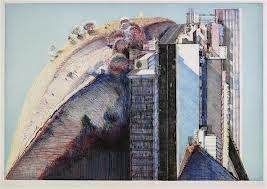
I have been enamored of Wayne Thiebaud’s work since I first saw it. His often electrifying colors, even used as shadows, show a masterful knowledge of color at its most evocative and seductive. He slathers on the brushwork like icing a cake, and admit it, don’t all of us have a hankering for some ‘sugary thang’ after seeing one of his cake and pie images? Admit it. Yes, you do. The man has made a lifelong pursuit of American subjects: diner food, and observations of landscape/cityscape, but he has always worked from life. He shows them off with such a finely orchestrated composition, you can't help wanting to devour one of his tasty morsels, or ride one of his extreme roller coaster California streetscapes.
The fact that Thiebaud has been doing prints is no surprise to us. His drawn line is simultaneously expressive and diagrammatic. His play with head-on compositions and asymmetry reminds us of the work of Jim Dine and Richard Diebenkorn. His printed surfaces are just as seductive as his paintings. The man knows his craft, so we can sit back and enjoy the linear ride, so to speak. Take a look at these gems....
Wayne Thiebaud, b.1920- is an American artist known for his luscious, brightly-painted still-lifes of production line objects found in diners and cafeterias, such as pies and pastries. As a young man in Long Beach, he worked at a cafe named Mile High and Red Hot, where "Mile High" was ice cream and "Red Hot" was a hot dog. He also chose to paint landscapes and cityscapes of northern California and San Francisco.
Thiebaud was born in Meza, Arizona, and grew up in a Mormon home in Hurricane, Utah and Long Beach, California. He studied commercial art at Long Beach Polytechnic High School and at the Frank Wiggins Trade School (a.k.a. Los Angeles Trade-Technical College) in Los Angeles and worked as a summer apprentice in the animation department at Walt Disney Studios. From 1939 to 1949 Thiebaud worked as a cartoonist, sign painter, and illustrator. He served as an artist in the First Motion Picture Unit of the United States Army Air Forces from 1942 to 1945. He attended San Jose State College (1949–50) and California State College at Sacramento (B.A. 1951/ M.A. 1953).
Thiebaud taught art at Sacramento Junior College (now Sacramento City College) from 1951 - 1960, and from 1960 -1990 he taught art at the University of California, Davis. He was active in theatre design work, created public murals and sculptures, and in 1954 he established a company to produce educational art films.
While on sabbatical, he lived for a year in New York City in 1956–57, became friends with Elaine and Willem de Kooning, and came under the influence of the Abstract Expressionists, the Bay Area figurative movement, and predate proto-pop artists Robert Rauschenberg and Jasper Johns. By the ’50s his work employed the thick, gestural brushstroke for everyday subjects: pinball machines, bakery counters, cosmetics—rendering them in bright colors and strong light. He also co-founded the Artists Cooperative gallery, now Artists Contemporary Gallery, and other cooperatives including Pond Farm, having been exposed to cooperatives in New York.In the 60’s Thiebaud turned to landscapes, but made them abstract using strange and unusual angles and vantage points. His streetscapes, and cityscapes were influenced by the work of Richard Diebenkorn. His works are noted for their austere hyper-realism, and have been compared to the work of Edward Hopper and Jim Dine. In 1962, Thiebaud's work was included (with Roy Lichtenstein, Andy Warhol, Jim Dine, Phillip Hefferton, Joe Goode, Edward Ruscha, and Robert Dowd) in the ground-breaking "New Painting of Common Objects," at the Pasadena Art Museum (now the Norton Simon Museum of Art at Pasadena). This exhibition is historically considered one of the first Pop Art exhibitions in America.
Exhibitions/Awards:
1962 - Sidney Janis Gallery, New York
1984 - Special recognition award, National Association of Schools of Art and Design
1985 - American Academy and Institute of Arts and Letters, NY
1986 - Associate of National Academy of Design, NY
1988 - Honorary Doctorate Award, San Francisco Art Institute, San Francisco, CA
1988 - Fellow to the American Academy of Arts and Sciences, Boston, MA
1994 - National Medal of Arts, from President William Jefferson Clinton
1996 - The Gold Medal for Lifetime Achievement in the Arts Award from the National Arts Club, NY
1996 - Award of Excellence from the National Park Service
2001 - Lifetime Achievement Award for Art from the American Academy of Design, NY
Collections:
Museum of Modern Art, NY, the San Francisco Museum of Modern Art, CA, and the Art Institute of Chicago, IL
Thiebaud once said, "An artist has to train his responses more than other people do. He has to be as disciplined as a mathematician. Discipline is not a restriction but an aid to freedom. It prepares an artist to choose his own limitations…"
Clearly, these prints demonstrate a love of line, and entice us with what we see and what is left unseen. Our thirst for his images is unquenched, our cravings for more unsatisfied; for we can Never get enough of Thiebaud's keyed up color, his delicately simple enticements of rows and rows of candy and all things sugary. but I especially enjoy his challenge to reinvent the hillsides of California into the scariest and best ever thrill-seeker rides of our lives. Anything on those streets on wheels is in for one rollicking ride, my friends.
Subscribe to:
Posts (Atom)


.jpg)


.jpg)
.jpg)


.jpg)