Wednesday, July 29, 2015

Raoul Dufy's Insatiable Appetites

The prints of Raoul Dufy are a delight to behold. They carry the same joie de vivre which we see in most of his colorful paintings. Something sparkles, glitters with light and color, even when the image is only black and white. His prints and book plates have a glittering light and we can feel the sweet summer breeze coming in off the Mediterranean when we see his sailor dancing with his paramour, the sway of the leaves of the trees being blown by the gentle sea breezes, the playful quality of the fish and octopus swimming in the sea, sleeping muses floating on the lapping waves like a sailor’s mirage of Venus, and a host of other subjects.


The man loved the coast, the water, and watching sail boats come in and go out of the harbor. It speaks to a life of luxury and freedom, wealth, but moreso the work speaks of a person enjoying life. What could be more French? Matisse, one of Dufy’s heroes, often said his work was meant to reflect a Frenchman’s life; enjoying one’s insatiable appetites, pleasures and desires. Dufy takes that mantra to heart and shows us a life of leisure, enjoyment and happiness.


His marks are playful, even childlike, but they are accurate and give us a sense of distance, place and dream vs. reality. I enjoy his delicately drawn etchings and the sensuousness he lovingly gives his muses. The relief prints are more brutish, but have a curvilinear line that does not take in the seriousness of the German Expressionist prints he admired. His work retains its joy no matter which media he explored. I am glad to have found these prints, and hope you enjoy them as well.
Bio = Raoul Dufy (1877–1953) was a French artist most closely aligned with the Fauvism movement. He developed a colorful, decorative style that popular in ceramics and textile design, and he was also known for his work in drawing, printmaking, illustration, and murals.
Dufy was born into a large family at Le Havre. He left school to work in a coffee-importing company until the age of eighteen. From1895-1900, he took art classes at Le Havre's École des Beaux-Arts. After a brief period of military service, Dufy won a scholarship to attend the École Nationale Supérieure des Beaux-Arts in Paris. While there, he was influenced by the works of Claude Monet, Camille Pissarro, Paul Cezanne, Vincent van Gogh, Georges Braque and Henri Matisse.


After seeing the work of Matisse in 1905, Dufy painted as a Fauve until 1909, when he saw the work of Paul Cezanne and adapted a more subtle palette. Dufy developed his own style around 1920 which was called ‘stenographic’.
Dufy liked the Expressionists’ use of relief printing and it led him to illustrate books for Apollinaire and Mallarme. In 1911 he began using relief prints to design textiles with fashion designer Paul Poiret. He also designed fabrics for the textile company Bianchini-Ferrier, from 1912-1930. As an accomplished interior designer, he regularly exhibited his work at the Salon des Artistes Décorateurs. He also painted murals for public buildings.
Dufy painted in the vicinity of Le Havre, and the beach at Sainte-Adresse. During the 1920s, Dufy's colorful works depict yacht races, the racecourse and the sparkling French Riviera with its parties. His work always had a sense of joie de vivre, and a lot of the work in this article includes his love of being near the sea.


In the late 1940s and early 1950s Dufy exhibited at the annual Salon des Tuileries. By 1950, he struggled with rheumatoid arthritis and took experimental treatments to regain the use of his hands. In 1952 he received the grand prize for painting in the 26th Venice Biennale, and died the next year in Forcalquier, at the age of 76. He was buried in the Cimiez Monastery Cemetery, near Matisse, in a suburb of Nice.

‘My eyes were made to erase all that is ugly’ – Raoul Dufy


He did, indeed.

Tuesday, July 21, 2015

Romare Bearden's Af-Am Fusion

Romare Bearden’s prints have a visual flow with his more well-known collages. Printmaking was one of many art media the artist pursued during his long career, but something special happens with his prints, (and I admit, I may be a bit biased toward the medium). They have either the flat rich color of the Caribbean, a place he lived for a period of time, or they have a fluid, juicy look as though someone is playing around with watercolor and a brush. Sometimes the textures found in his work are rich and woven, like fabric.

Other times the combination of his textures and seeing a person’s eyes popping out of the composition speak about sadness, pain and endurance. In any case, the work weaves a patchwork of experience that is uniquely his own, talking about a group of Americans whose choice to come to this country was forced upon them, but who rose and persevered to become some of the greatest artists, musicians and writers of the 20th century. Bearden can easily be one of those notable African-American artists, but his work tells a visual story about the Af-Am struggle, from the deep south, to the creative freedom found in the north. His work uses photographic collages of faces, African-American faces, and cuts them into shards, shreds their individuality and melds them together, creating one African American. One people. One experience.

That’s a hard thing to do, to speak about a race of people whose dignity as human beings were stripped bare and their ancestry torn from their memories. How does one show that horror, and instinctual human effort to survive adversity? Bearden does it by not covering up the situation or making it palatable. He shows the collaged body parts and efforts to do normal things anyone would do, but he shows them cut up, glued back together in a hodgepodge. Not really a clear identity of them as a person, but a collective of them as a race, and group. Strength woven through their brokenness.

Bearden goes where no other artist would have gone before him. Certainly, many artists have felt liberated to speak their own truths because of his stance. My God, he was brave. It could likely have been the strong mother figure he was raised by who instilled a strong sense of self on Bearden, but also his own personal experiences during WWII helped shape his ideas about art and identity. I, for one, see the message through the media; how printmaking helped him extend his work, his calling. Young artists working today have a good role model and teacher in the Af-Am fusion prints of Romare Bearden.

BIO
Romare Bearden
(1911 –1988) was an American artist who depicted African-American life, mainly through collage. Born in Charlotte, North Carolina, his family moved to New York City when he was a child. His mother, Bessye Bearden, was politically active in New York City's Board of Education, and the Colored Women's Democratic League. The Bearden household was also a meeting place for major artists and writers of the Harlem Renaissance.

Bearden went to Lincoln University and Boston University before transferring to New York University, where he graduated in 1935. He continued his artistic studies under George Grosz at the Art Students League in 1936 and 1937. While in New York, Bearden went to work in Bob Blackburn’s printmaking studio. He learned about printmaking there and continued to pursue various print mediums throughout his career. He served in the Army during WWII, from 1942-1945. Then in 1950, he went to study Art History at the Sorbonne, in Paris.

In 1954, he married a dancer, Nanette Bearden, who later became an artist and a critic.

In 1956, Bearden began studying Chinese calligraphy. His early work focused on unity and cooperation within the African-American southern community, and his style was strongly influenced by muralists Diego Rivera and José Clemente Orozco. He briefly experimented with abstraction, but began to make collages in the 1960s. He took his imagery from daily rituals of African-Americans’ southern rural life and their northern urban life, combining these experiences with his own. He felt collage was able to combine abstraction with real images of people from different cultures so one could understand something of the African-American experience.

Bearden was a founding member of the The Spiral, a Harlem-based art group formed to discuss the African-American artist’s struggle for civil rights. It was during the 1960s civil rights movement that Bearden's work became more representational and more socially conscious. For him, collage presented a direct connection with African Americans’ rights which were always shifting, and society itself was in a state of constant change. Bearden wanted to show how nothing is set in stone, and the image will always change.

Romare Bearden died in 1988, in New York City. The Romare Bearden Foundation was established two years after his death "to preserve and perpetuate the legacy of this preeminent American artist."


Awards
1987 National Medal of Arts
1978 National Academy of Design
1972 National Institute of Arts and Letters
1966 American Academy of Arts and Letters

Wednesday, July 8, 2015

The Abstract Side of Warrington Colescott

In commemoration of Warrington Colescott's significant achievements in printmaking, I am re-posting this article on his work. R.I.P. 9/14/2018

Warrington Colescott is mostly known as an American printmaker of satirical subjects. His work expresses a vivid imagination, interpreting contemporary and historical events. Yet, in his earlier more abstract phase, his work borders on something reminiscent of the curvilinear figures one finds in the works of Matisse and Cezanne; and the arabesque gestural lines he uses deftly lead the viewer through the composition to see all the lovely, weirdly grotesque and erotic figures we find therein. This article will focus on his earlier work, which shows his homage to Hayter and other well-known artists.


Colescott was born in 1921 to Warrington, Sr. and Lydia Colescott. His parents who were of Louisiana Creole descent moved to Oakland in 1920 where he was born. His younger brother, Robert, is also an artist. Comic strips, vaudeville and the burlesque at Oakland’s Red Mill/Moulin Rouge theater were important influences upon Colescott’s work. He made cartoons and did some writing for both the Pelican and The Daily Californian when he attended University of California at Berkeley.


Colescott studied painting at the University of California, Berkeley, and started to make prints in 1948 while he was teaching at Long Beach City College. He continued to make prints when he moved to Wisconsin to teach at the University of Wisconsin - Madison. Alfred Sessler introduced Colescott to etching in the mid-1950s, and Colescott continued to his study of printmaking at London’s famous Slade School of Fine Art.


Colescott gained critical attention in the 1950s, when he was included in the Museum of Modern Art’s 1953 Young American Printmakers exhibition, and exhibits at the Whitney Museum of American Art in 1955 and 1956. Critics have compared his graphic and satirical style, to artists like Francisco Goya, Honoré Daumier, Max Beckmann, and George Grosz.


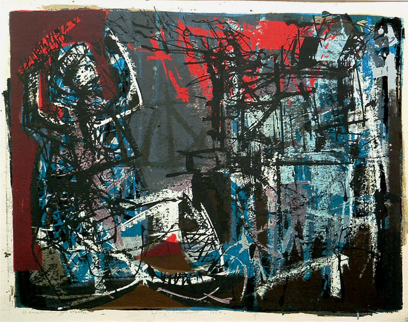
His early graphic work was more abstract. That work contains some reference to the linear flow of Stanley William Hayter’s work, but his colors are dark and sometimes more tonal than colorfully expressive. By the early 1960s his satirical imagery evolved and he devoted his time to complex color etching, and incorporated bits of letterpress into his compositions. As his work became less abstract and more narrative, this allowed him to fully explore his satirical commentary on subjects of the civil rights struggles in the South, racism, violence, and a series on Depression-era gangster, John Dillinger.


Colescott’s mature style became evident in his series The History of Printmaking (1975–78), where he describes important developments in the evolution of printmaking with various printmakers. Since the 1970s, Colescott has continued to pursue social satire in his work with subjects on burlesque, popular culture, the afterlife, and places like California, Wisconsin and New Orleans, the home of his ancestors. Recently, Colescott has turned his attention to the Middle East conflicts in Iraq and Afghanistan. He lives and works in Hollandale, Wisconsin.


Education
1942 - BFA at the University of California, Berkeley.
1942-46 – served in the Army in World War II
1947 - MFA at the University of California, Berkeley
1947-1949 taught art at Long Beach City College
1949- 1986 taught at the University of Wisconsin–Madison
Continuing studies:
1952-53 -Académie de la Grande Chaumière, Paris
1956–57 Fulbright Fellow, Slade School of Fine Art, University of London
1963 - Guggenheim Fellowship, London


Exhibitions
1979 – A History of Printmaking, Madison Art Center
1988-89 Elvehjem Museum of Art (now the Chazen Museum of Art), University of Wisconsin–Madison
1996 and 2010 - Milwaukee Art Museum


Honors
1957 - Fulbright Fellowship
1965 - John Simon Guggenheim Memorial Foundation Fellowship
1975 - National Endowment for the Art Printmaking Fellowship
1979 & 1983 - National Endowment for the Arts
1992 - Academician of the National Academy of Design
Fellow of the Wisconsin Academy of Sciences, Arts, and Letters


Collections
Art Institute of Chicago
the Bibliothèque Nationale de France
Brooklyn Museum
Carnegie-Mellon Museum
Chazen Museum of Art in Madison
Cincinnati Art Museum
Columbus Museum of Art
Los Angeles County Museum
Madison Museum of Contemporary Art
Metropolitan Museum of Art
Milwaukee Art Museum
Museum of Modern Art
Museum of Wisconsin Art in West Bend
National Gallery of Art
New York Public Library
Portland Art Museum
Smithsonian American Art Museum
Tate Gallery of Modern Art
Victoria and Albert Museum
Whitney Museum of American Art

Saturday, July 4, 2015

Printmakers Celebrate Lady Liberty


There she is, folks. The lady herself. The symbol of our country, and the protectorate of our ideals. Lady Liberty.In celebration of our nation’s birthday, this post is dedicated to our national symbol, The Statue of Liberty (Liberty Enlightening the World). Of course, there are numerous artists who have created prints to commemorate this classic example of our democracy and all of the good things we stand for. As you will see, my inked up friends, the statue evolves and morphs according to the style and period of the time in which the prints were made; but the overwhelming purposeful Neoclassical quality of its design shines through.


Some say our Lady Liberty is handsome, and some say she is beautiful. I think of her as our Mona Lisa, strong, purposeful, yet serene in her convictions to be a beacon of light leading the masses to a new world (the U.S.). She gives comfort to the masses, who like a child, clings to its mother for protection. She has withstood the tests of time and renovation, stood stalwartly strong in the face of the terrorist attacks upon the World Trade Towers, and been a welcoming face to millions of tourists and migrants to this country. It is inconceivable at this point to separate her from our national identity. She is, simply put, Amazing.


To give you a little background information about our Lady Liberty, she is a colossal sculpture sitting on Liberty Island, in New York City. The statue, designed by French sculptor Frédéric Auguste Bartholdi, was built by Gustave Eiffel and dedicated on October 28, 1886. It was a gift to the United States from the people of France.


The statue is of a robed female figure representing Libertas, the goddess of freedom widely worshipped in ancient Rome, especially among emancipated slaves. She bears a torch and a tablet, upon which is inscribed the date July 4, 1776 commemorating our American Declaration of Independence. A broken chain lies at her feet. The statue is an icon of freedom and of the United States, and was a welcoming sight to immigrants arriving from abroad.


The statue was constructed in France, shipped overseas, and assembled on Bedloe's Island. The statue was administered by the United States Lighthouse Board until 1901 and then by the Department of War; since 1933 it has been maintained by the National Park Service.


Bartholdi’s design was inspired by French law professor and politician Édouard René de Laboulaye, who hoped that by calling attention to the democratic achievements of the United States, the French people would be inspired to call for their own democracy.


Bartholdi had made a first model of his concept in 1870. Bartholdi made the first sketches for the statue during his U.S. visit at American artist John La Farge's Rhode Island studio. Bartholdi wished to give the statue a peaceful appearance and chose a torch, representing progress, for the figure to hold. He placed a diadem on top of its head to project seven rays of light, to evoke the sun, the seven seas, and the seven continents. Reputedly the face was modeled after that of Charlotte Beysser Bartholdi, the sculptor's mother. He gave it bold classical contours and applied simplified modeling, reflecting its solemnity.


Bartholdi obtained the services of Gustave Eiffel, who made the statue one of the earliest examples of curtain wall construction, in where the exterior of the structure is supported by an interior framework. The completed statue was formally presented at a ceremony in Paris on July 4, 1884. From there, the statue was disassembled and shipped to the US.


Bartholdi chose Bedloe's Island as a site for the statue, because all ships arriving in New York had to sail past it. The statue’s foundation was laid inside Fort Wood, a disused army base on Bedloe's Island. The fortifications of the structure were in the shape of an eleven-point star. The statue's foundation and pedestal were aligned so that it would greet ships entering the harbor from the Atlantic Ocean. In 1881, Richard Morris Hunt was commissioned to design the pedestal. His design contains elements of classical and Aztec architecture, including Doric portals. Bartholdi placed an observation platform near the top of the pedestal.


On June 17, 1885, the statue arrived in the New York port. Two hundred thousand people lined the docks and hundreds of boats put to sea to welcome the French steamer Isère. Norwegian immigrant civil engineer Joachim Goschen Giæver designed the structural framework for the Statue of Liberty once it was ready to assemble on Bedloe’s Island. Once the statue was assembled, President Grover Cleveland, who presided over a dedication ceremony held on October 28, 1886, stated that the statue's "stream of light shall pierce the darkness of ignorance and man's oppression until Liberty enlightens the world".


Our Lady Liberty is a symbol of all that is good and upstanding about our country. The prints selected for this post reflect her strength and inspire patriotism. If you haven’t visited this national treasure, take a trip to New York City, visit the World Trade Tower Memorial and then take a ferry out to visit this lovely lady. It’s a pilgrimage we all should do.


Happy fourth of July to everyone!