Tuesday, November 13, 2018

The Sublime Prints of Martin Puryear


The notable art critic Robert Hughes once called Martin Puryear "America's Best" of sculptors. He has become an internationally renowned artist known for his exceptional craftsmanship, powerful and elegant forms, and his poetic approach to technique often pushes the physical boundaries of material. His work is distinguished by its inventive form and meticulous craftsmanship. His images are described as organic abstractions, pared down forms that refer to the natural world, like seedpods, sunbursts, tree-rings, etc.


His works enclose space, suggesting a combination of protection, survival, sanctuary, or captivity. His prints combine the organic and the geometric; creating a rationality in each work derived from the artist’s act of creating.
Often associated with both Minimalism and Formalist movements, Puryear’s works suggest narratives filled with the possibility of meaning; they are not only compelling objects but they are enticing for the revelation one discovers from engaging with them.
In some of his prints his delicately drawn interlacing lines create vessel-like forms, linear shapes with darkened stippled marks, latticed and woven structures. His lines suggest inside/outside space, containment/freedom and what is interior/exterior.


Born in 1941 Washington, D.C., Puryear began as a child making various tools, boats, musical instruments, and furniture. As his art his developed, his love for natural form and materials became pronounced. He currently lives and works in New York’s Hudson Valley.

Education:
1971 MFA Yale University, New Haven, CT
1966-68 Royal Swedish Academy of Arts, Stockholm, Sweden
1963 BA Catholic University of America, Washington , D.C.

Awards:
1979, 1981 and 1989 - included in the Whitney Biennial at the Whitney Museum of American Art in New York City.
1982 - Guggenheim Memorial Foundation Fellowship, to study Japanese architecture and garden design.
1989 - MacArthur Foundation Fellowship
2007 - Gold Medal in Sculpture by the American Academy of Arts and Letters
2011 - National Medal of Arts
2019 – sole artist to represent the United States at the Venice Bienale

Public Works:
City of Chicago, IL
John P. Getty Museum, Los Angeles, CA
Washington D.C.
York College, Queens, NY

Teaching:
Fisk University, Nashville, TN
University of Maryland, College Park, MD

https://art21.org/watch/extended-play/martin-puryear-printmaking-short/


Friday, September 14, 2018

A Significant Printmaker, Warrington Colescott...R.I.P.

In commemoration of Warrington Colescott's significant achievements in printmaking, I am re-posting this article on his work. R.I.P. 9/14/2018

Warrington Colescott is mostly known as an American printmaker of satirical subjects. His work expresses a vivid imagination, interpreting contemporary and historical events. Yet, in his earlier more abstract phase, his work borders on something reminiscent of the curvilinear figures one finds in the works of Matisse and Cezanne; and the arabesque gestural lines he uses deftly lead the viewer through the composition to see all the lovely, weirdly grotesque and erotic figures we find therein. This article will focus on his earlier work, which shows his homage to Hayter and other well-known artists.


Colescott was born in 1921 to Warrington, Sr. and Lydia Colescott. His parents who were of Louisiana Creole descent moved to Oakland in 1920 where he was born. His younger brother, Robert, is also an artist. Comic strips, vaudeville and the burlesque at Oakland’s Red Mill/Moulin Rouge theater were important influences upon Colescott’s work. He made cartoons and did some writing for both the Pelican and The Daily Californian when he attended University of California at Berkeley.


Colescott studied painting at the University of California, Berkeley, and started to make prints in 1948 while he was teaching at Long Beach City College. He continued to make prints when he moved to Wisconsin to teach at the University of Wisconsin - Madison. Alfred Sessler introduced Colescott to etching in the mid-1950s, and Colescott continued to his study of printmaking at London’s famous Slade School of Fine Art.


Colescott gained critical attention in the 1950s, when he was included in the Museum of Modern Art’s 1953 Young American Printmakers exhibition, and exhibits at the Whitney Museum of American Art in 1955 and 1956. Critics have compared his graphic and satirical style, to artists like Francisco Goya, Honoré Daumier, Max Beckmann, and George Grosz.


His early graphic work was more abstract. That work contains some reference to the linear flow of Stanley William Hayter’s work, but his colors are dark and sometimes more tonal than colorfully expressive. By the early 1960s his satirical imagery evolved and he devoted his time to complex color etching, and incorporated bits of letterpress into his compositions. As his work became less abstract and more narrative, this allowed him to fully explore his satirical commentary on subjects of the civil rights struggles in the South, racism, violence, and a series on Depression-era gangster, John Dillinger.


Colescott’s mature style became evident in his series The History of Printmaking (1975–78), where he describes important developments in the evolution of printmaking with various printmakers. Since the 1970s, Colescott has continued to pursue social satire in his work with subjects on burlesque, popular culture, the afterlife, and places like California, Wisconsin and New Orleans, the home of his ancestors. Recently, Colescott has turned his attention to the Middle East conflicts in Iraq and Afghanistan. He lives and works in Hollandale, Wisconsin.


Education
1942 - BFA at the University of California, Berkeley.
1942-46 – served in the Army in World War II
1947 - MFA at the University of California, Berkeley
1947-1949 taught art at Long Beach City College
1949- 1986 taught at the University of Wisconsin–Madison
Continuing studies:
1952-53 -Académie de la Grande Chaumière, Paris
1956–57 Fulbright Fellow, Slade School of Fine Art, University of London
1963 - Guggenheim Fellowship, London


Exhibitions
1979 – A History of Printmaking, Madison Art Center
1988-89 Elvehjem Museum of Art (now the Chazen Museum of Art), University of Wisconsin–Madison
1996 and 2010 - Milwaukee Art Museum


Honors
1957 - Fulbright Fellowship
1965 - John Simon Guggenheim Memorial Foundation Fellowship
1975 - National Endowment for the Art Printmaking Fellowship
1979 & 1983 - National Endowment for the Arts
1992 - Academician of the National Academy of Design
Fellow of the Wisconsin Academy of Sciences, Arts, and Letters


Collections
Art Institute of Chicago
the Bibliothèque Nationale de France
Brooklyn Museum
Carnegie-Mellon Museum
Chazen Museum of Art in Madison
Cincinnati Art Museum
Columbus Museum of Art
Los Angeles County Museum
Madison Museum of Contemporary Art
Metropolitan Museum of Art
Milwaukee Art Museum
Museum of Modern Art
Museum of Wisconsin Art in West Bend
National Gallery of Art
New York Public Library
Portland Art Museum
Smithsonian American Art Museum
Tate Gallery of Modern Art
Victoria and Albert Museum
Whitney Museum of American Art

Monday, August 6, 2018

Cecil Tremayne Buller's Songs of Solomon


The prints of Canada’s Cecil Buller are both analytic and evocative, passionate and diagrammatic. It is a rare ability for an artist to dually describe events and subjects in such measured and balanced equal terms, but she does it with aplomb.


Cecil Tremayne Buller (1886 –1973) was born and raised in Montreal. She is well-known for producing a series of prints for her book Song of Solomon in 1929. She also provided illustrations for Cantique des cantiques which were published in Paris in 1931. I have selected some of these images to review for this article.


The Songs of Solomon set is one of the scrolls found in the last section of the Tanakh, and a book of the Old Testament. This set is unique within the Hebrew bible because it celebrates sexual love and the yearning between two lovers. The two each desire each other and rejoice in their intimacies; and we, as the audience, witness the lovers' erotic encounters. In a sense, one can even see the sweet engagement between the two lovers as they embrace, similarly to Antonio Canova's Cupid and Psyche. The feelings we take away from both pieces is the same.


Buller’s ability to transform the human figure from sinuous biomorphic forms into loosely fragmented sections that resemble the works of Fernand Leger and some of the German Expressionists, yet retain their organic origins, is amazing.


Her figures are engaged with each other to the exclusion of we the audience, who are privy to their encounters. The hunger and need of the figures for one another is earthy and basal. We feel their desire, and we can ourselves escape into their reverie for one another. Truly, Buller has evoked a sensual and gentle depiction of these two lovers, and we are blessed to know of it.


As for Buller’s artistic studies, she studied at the Art Association of Montreal, and the Art Students League, in New York City. In 1912, she went to Paris to where she studied with famed Fauve artist Maurice Denis. Four years later, she went to London to study printmaking at the Central School of Art and Design. While there, she met her future husband John J. A. Murphy; they eventually settled in New York City in 1918. She later returned to Montreal in 1961, and lived there the rest of her life.


Awards:
1945 the Pennell Prize from the Library of Congress
1947 and 1953 the Audubon Society Award
1949 the National Academy of Design Graphic Art Award


Public collections:
Bibliothèque nationale de France in Paris
British Museum
Library of Congress
Metropolitan Museum of Art
National Gallery of Canada
New York Public Library


Friday, July 6, 2018

The 'Other' Capriccios Prints by William Gropper

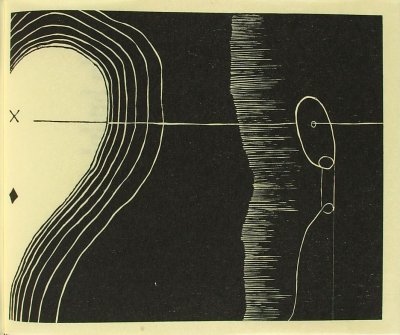
Just to scare the crap out of you, you must witness something weird and wonderful in William Gropper's 'Capriccios' print series. Talk about some compositions that can fill a child's dreams with nightmares..... Gropper's prints have some extremely creepy scary creatures. The prints are filled with maniacal faces, bared teeth and ghoulish eyes. These 'things' swoop in from the stealth of night and are eager to devour something (we hope it isn't us). I, for one, am both mesmerized by these creatures' appearance, and reviled by their ability to easily entice us to join them to a journey to the netherworld. They are fiendish, evil and you can't look away from them.

Gropper's works have an uncomfortableness about them. No sense of groundedness. Floating figures within wind-swept environments. No place to rest from the craziness that surrounds us. The artist knows how to keep us off-kilter. We can't find a quiet place to sleep, or hide from these 'things'. Night of the Living Dead is an apt description for some of this, but Gropper's roots for this series are found further back in time. A place called Spain, in the late 1700s, emanating from the critical vision of an artist we know as Francisco de Goya. There was another Caprichos series, one highly critical of the social strata of the day, and the social folly of the ruling class. Goya was scathing in his series and left no stone unturned that didn't deserve it. Those prints are exceptionally great and we can derive a better understanding of our own current political craziness if we but look at those prints and compare them to events in our own time. But I digress....


Gropper's compositions are chaotic, and uncomfortable. His lines are a bit lyrical, but also clipped and chopped up. I am reminded of some similiarities to the linear qualities of Willem DeKooning's paintings and drawings.

In this capriccios series, there are depictions of the working class. The endless toil and struggle of work that never ends. There are also apocalyptic scenes of ghouls and skeletal figures ready to sweep in to take a soul or two with them to wherever they came from. They are the undead, and we are their prey.


Other images of horses and piles of the dead remind us of works by Picasso during his Guernica period, but Gropper's work is more bleak. These legacies, and Gropper's interest in the work of Daumier, are evident in his prints.

I will share with you Gropper's biography so you can know more his motivations for this richly dark series. Enjoy my friends....


William Victor "Bill" Gropper (1897 – 1977) was an American artist, best known for his radical political work. He was born in New York City, to Jewish immigrant parents from Romania and the Ukraine. While Gropper’s father was a university-educated man fluent in several languages, he was unable to find employment. The result was that his parents worked in abject poverty in the city's garment industry on the Lower East Side.


Gropper’s artistic beginnings came from his chalk drawings on the sidewalks in front of his home. At age 13, he studied art at the Ferrer School, under notable artists George Bellows and Robert Henri. When he graduated from public school, he earned a medal in art, and a scholarship to the National Academy of Design. A couple of years later he was offered a scholarship to the New York School of Fine and Applied Arts (now the Parsons School of Art).


In 1917, Gropper was offered a position on the staff of the New York Tribune, where he earned a steady income creating drawings for the paper's Sunday feature articles. Gropper also contributed his work to a revolutionary socialist weekly called The Revolutionary Age, as well as to The Rebel Worker, a magazine of the Industrial Workers of the World.


In August 1921, Gropper married Gladys Oaks, but the marriage was short-lived.
Three years later he married Sophie Frankle. Together, they built a house and raised their family in Croton-on-Hudson, New York. The couple spent a year in the Soviet Union, where Gropper was employed on the staff of the newspaper of the All-Union Communist Party, Pravda.

Back in the states, Gropper also worked on mural projects for the Works Progress Administration (WPA).
During the second half of the 1930s, Gropper dedicated his art to the efforts to raise popular opposition to fascism in Europe. Due to his involvement with radical politics in the 1920s and 1930s, Senator Joseph McCarthy, chair of the Committee on Government Operations, subpoenaed Gropper to appear before the House Un-American Activities Committee’s Permanent Subcommittee on Investigations in May 1953. Invoking the Fifth Amendment, Gropper refused to answer any questions and was subsequently blacklisted. This experience inspired him to create a series of prints entitled the Capriccios.


Writing on his Capriccios series, Gropper said, “‘The right to life, liberty or pursuit of happiness’ are mere words without meaning when mouthed by corrupt politicians, the State Dept., intellectual [sic] or artists who stand by in silence while bigotry is at work”.

Although he faced opposition to his work following the McCarthy hearings, Gropper’s Capriccios series presented a specific response to McCarthy’s committee, which struck an accord with the underprivileged public and enraged the corrupt politicians. Gropper’s Capriccios expressed his disdain for the American ideological culture of the 1950s.
Nixon’s Watergate scandal in 1973 sparked the artist’s last political series in his long struggle against political corruption.
Gropper died at the age of 79 in Manhasset, New York.


Honors and Awards:
Instructor at American Art School, New York, NY
Founder of Artists Equity Association
Los Angeles County Museum Purchase Prize
National Academy of Design as an Associate Academician
Young Israel Prize

Exhibitions:
Galerie Benezit, Paris, France
La Galerie del Frente Nacional des Artes, Mexico City, Mexico
Judah L. Magnus Museum, Berkeley, California
Piccadilly Gallery, London, England

Tuesday, July 3, 2018

Celebrate the 4th!

Greetings to all my inked up brethren. I am wishing you all a happy and safe 4th of July, wherever you may be. Pull out the grill, heat up some hotdogs and burgers, drink a few cold brew and enjoy watching the kids splash in the pool, or skiing at the lake. It's a time to celebrate what's great about our country and being with family and friends. Enjoy this treasured print about Lady Liberty and the Star-Spangled Banner from Currier & Ives.

Tuesday, June 26, 2018

Frances Gearhart Glorifies California's Landscape


Frances Hammell Gearhart (1869 –1959) was an American artist known for her vibrant and colorful prints of America’s (Californian) landscape.
Born in a small village called Sagetown, in Illinois, she moved to California in 1888 and began studying at the State Normal School at Los Angeles (now UCLA). After graduation she supported herself by teaching high school English.


At her first one-person exhibition in 1911 at Los Angeles’ Walker Theatre Gallery the local art critics described her as a promising colorist. Gearhart’s sisters, May and Edna, taught her printmaking after they studied at the Ipswich Summer School of Art in Massachusetts with Arthur Wesley Dow. It is estimated that she created 250 editioned prints.


Influenced by the Arts and Crafts movement, Gearhart made prints that featured strong use of black or blue lines with rich colors offset against deep backgrounds. She frequently made compositions of country paths, roads, and waterways to lead the viewer into the image. The combination of her lines with atmospheric color was well suited to depict California's beautiful landscapes.


Gearhart devoted herself full-time to art in 1923. She and her sisters then set up an art gallery in Pasadena, CA, where they curated printmaking exhibitions.
Her art production declined after 1940 when her eyesight began to fail. She died in Pasadena, California. She is now recognized as one of the most important American printmakers of the early 20th century.


Memberships:
San Francisco-based California Society of Etchers (California Society of Printmakers)
Print Makers Society of California (PMSC)
Prairie Print Makers
American Federation of the Arts


Exhibitions:
Oakland Art Gallery
Casa de Maňana Gallery of Berkeley
San Francisco Museum of Art
Print Rooms of San Francisco
Stanford University Art Gallery
Carmel's Arts & Crafts Club
Brooklyn Museum
Chouinard Art Institute
Toronto Museum
Worcester Art Museum

Her work is included in numerous museum collections.