Saturday, December 31, 2011

Helen Frankenthaler's Prints Expand the Medium

Several newspapers have noted the recent passing of American artist Helen Frankenthaler, and her contributions in the field of 20th c. painting. While her accolades in that area are numerous; having received recognition by way of dozens of honorary doctoral degrees, being a presidential appointee to the National Council on the Arts and a recipient of the National Medal of Arts from President George W. Bush in 2002, her accolades in printmaking have yet to be adequately praised.  I will begin by acknowledging Frankenthaler’s artistic beginnings and proceed to look at some of her prints, which are nothing short of spectacular.

Helen Frankenthaler was born the third of three daughters to a wealthy New York family. She was educated at the Dalton School studying under Rufino Tamayo, and at Bennington College in Vermont.  She later studied with the effervescent Hans Hofmann, whose advocacy of a ‘push-pull’ methodology lead to the Abstract Expressionist movement.

In her mid-twenties, her now famous ‘pour and stain’ approach to painting gained the attention of critic Clement Greenberg, and she was proclaimed the ‘bridge’ between the artists working in Abstract Expressionism to the Color Field Painters. She was included in a show about Post-Painterly Abstraction and the moniker stuck. Her personal relationship with Greenberg, and later marriage to Ab Ex painter/writer Robert Motherwell, propelled Frankenthaler into the midst of two male-dominant art movements, where she became friends with artists David Smith, Franz Kline, Jackson Pollock and Willem and Elaine de Kooning.

Frankenthaler, along with fellow painters Grace Hartigan, Joan Mitchell, Lee Krasner, and Elaine deKooning made their work, and rebuffed the idea of feminism, or being recognized for their sex over their artwork. They saw themselves as artists and the equal of their male peers. She said,"I had something to say in terms of painting and went about doing it.... What has made it work, or what makes certain paintings successful or not, has to do with my being a painter and a thinking, feeling person, more than my sex, color, height, origin." 

It wasn’t until 1961 that Frankenthaler made her first print, but in the 1970s, she began to gain recognition for her printmaking. She went to Japan and studied traditional woodblock techniques where she produced a body of work inspired by the 11th c. "The Tale of Genji" series.

She became known as an innovative printmaker. Her inventive lithographs, etchings and screen prints resembled her paintings, but most people agree it was her woodblock prints that opened new doors for her creatively. They possessed a fresh approach, both in color and in scale.  She was able to produce a level of nuanced color and line rarely seen previously in a medium not known (at least not in the West) for its subtlety. Through her woodblocks and experimental prints,  like 1974's "Savage Breeze", she helped re-open the door to printmaking at a time when it had been suffering from lack of interest, and inspired other artists to re-explore that medium.


Frankenthaler went to make prints at ULAE at the invitation of Tatanya Grossman. She took to it like a duck to water and felt the experience liberated her. She also worked with Ken Tyler at Tyler Graphics in upstate New York, and by the time of her death had produced over 150 editioned prints and over two hundred monotype/mixed media works.

“East and Beyond” was Frankenthaler’s first foray into making the grainy, unforgiving wood block receptive to her own sense of vibrant, though translucent, color and organic forms. Her composition was so open compared with traditional woodblock techniques that it has had a deep influence on the medium ever since. It would eventually become known to the development of contemporary printmaking what “Mountains and Sea” had been to the development of Color Field painting.

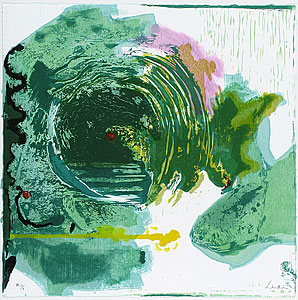
“Essence Mulbery” (as seen above) is one of the first Frankenthaler prints I remember seeing. I was taken immediately by its subtle, multi-layered colors and what I’ll term ‘respect’ for the surface of the matrix and the feel of the paper on which it is printed . She understood how to work with the grain of the wood to make her images, and though she went onto other printmaking methods, her woodblocks remain my personal favorites. I saw, and still see in them, an extension pathway of her colorful field paintings. One also sees here a reference to Rothko’s own search for color field abstractions is felt in this work, (though he and some of the other Ab Ex painters ran their course and found nothing else to pursue or no new bridge to cross, thus ending their careers and their lives too soon.)
Frankenthaler’s prints eventually bridged the gap between her flowing painting style and her interested in the linear woodblocks. For that reason, I am showing one of her later prints and one of the woodblocks used to create it. The block itself is a work of art, with its delicate cuts and residual stains of color imbedded into the woodblock’s surface. Truly the woman understood the medium as a master should.


Critics weren’t always in agreement with Frankenthaler’s influence on 20th c. art, saying her later paintings didn’t have a certain weight as did her earlier works; that they ventured in to a marginal, pretty coloring phase, speaking of nothing in particular. Their short-sighted observations proclaim the difficulty an artist often has in maintaining the art world’s, or the critic’s, attention once their ‘true moment’ has passed onto successive movements. Artists mature and evolve, which sometimes goes against the forays of the art critic to find the next ‘thing’ that will transform a vision for future artists and movements.
Frankenthaler understood the changes of nature, and the art world. She was substantive and tough when the situation called for it, and in touch with the intuitive nature of color, and of what it means to be ‘human’ within those color-filled environments. Her prints stand alone as an inspiration for artists and printmakers, and her contribution to the medium cannot be questioned or underestimated.

Friday, December 30, 2011

Printmaking in Scandinavia!

For those among us that crave a northern setting in which to make their prints, I have gathered together a listing of print shops and printmaking associations in Scandinavia. The listings include establishments in Denmark, Finland, Iceland, Norway and Sweden. Considering the time of year, you may want to bring along a pair of skies, snow shoes and some treats for Rudolph and his reindeer friends to get you around town....


Fyns Grafiske Værksted - Denmark
Hans Jensens Stræde 18-20
5000 Odense C
Tlf.: 66 13 99 73
Website: http://fynsgv.dk
Email: 
fynsgrafiskevaerksted@mail.dk


Grafisk Eksperimentarium
Trepkasgade 8
DK-2100 Copenhagen, Denmark
Phone: (+45) 35 35 39 07
Contact Henrik Boegh
e-mail: 
artguide@post5.tele.dk
http://www.artbag.dk/
Danske Grafikere - Denmark

Printmaking Associations and print studios in Finland
Lahden Taidegraafikot - The Graphic Artist Association of Lahti
Turun Taidegraafikot - Turku Graphic Artists
Joensuun grafiikanpaja - Joensuu Print workshop
Jyväskylän grafiikkakeskus - Jyväskylä Centre for Printmaking
Suomen Taidegraafikot
Pieni Roobertinkatu 10
00120 Helsinki, Findland
Puh. 09-700 285 01

The Icelandic Printstudio
The Icelandic Printmakers’ Association
Tryggvagata 15
Po.Box 857 121 Reykjavík. Iceland

Islensk grafik - Iceland
TRYGGVAGÖTU 17, HAFNARMEGIN
101 REYKJAVÍK
PHONE +354 552 2866
P.O. BOX 857, 121 REYKJAVÍ

Norwegian Printmakers Association
Tollbugaten 24 N-0157 Oslo, Norway
Telephone: 47 2335 8940
Fax: 47 2335 8949

Norske Grafikeres Verksted
Fyrstikkalleen 17, 0661 Oslo, Norway
Tlf: 22 68 14 57
e-post: 
ngrver@online.no

Norske Grafikere – Norway
Tollbugata 24,0157 Oslo | +47 23 35 89 40 

Grafikverkstaden Brosarp
Magistervagen 13
S-277 50 Brosarp, Sweden
tel (+46) 414 911 11
E-mail: 
vera.jb@odata.se
Contact: Vera Ohlsson or J-B Andersson

Blind Street 44, 791 72 Falun SWEDEN. Phone 023-824 53,
fax 023-833 86th E-mail kontakt@fkv.nu . Web www.fkv.nu

Grafiska Sällskapet - Sweden
Hornsgatan 6
118 20 Stockholm
tel:08-643 88 04
E-mail: 
galleri@grafiskasallskapet.se

Grafikens Hus - Sweden
Graphic Gripsholm Royal Farm Houses 647 31 Mariefred
Tel. 0159-23160 E-mail info@grafikenshus.se

Friday, December 23, 2011

Happy Holidays, and Keep Those Fingers Inked UP!

To all of you wonderful artists out there who have been checking in to read what I've posted, I thank you for your support. That's Inked Up has already garnished a lot of attention world-wide, and helped to network our ever-growing printmaking family. Over the holidays, in addition to making some new images and keeping my fingers inked up, I will be working on a new group of articles, discussing some print meccas, and I anticipate bringing in some cool artists' work to show you.  FYI...I am interested in seeing any and all artists working in the printmaking medium, and encourage you to contact me. Just send me your resume, statement and a couple jpegs to teresajparker@gmail.com. Who knows? I might be writing something about your work and spreading more of what I'll call the Inky Fingers Network.

Also, just to let everyone know about  an opportunity that was posted this week, Ochosi Editions has put out an International Call for Artists to participate in  the  "Madonna International Print Exchange". You can find the information on the exchange at http://www.ochosieditions.blogspot.com/. Please RSVP by February 1st your intent to participate, and the editions are due May 1st.  The suite will be displayed at Benedictine University in Lisle, IL in May, and then travel to Monterrey, Mexico in September. I will be looking for other venues to exhibit the suite, so if you know of a place or institution that may be interested, let me know.

Wishing all of you a safe and productive holiday!

Tuesday, December 20, 2011

The Holiday Season Isn't Complete Without Currier & Ives

The holiday season is upon is and it can't be properly celebrated without noting the accomplishments of one of the most lucrative and popular printing establishments in US history.This lovely scene, showing a winter-time horse and carriage race, is a fine example of the types of prints produced by Currier & Ives.

The partnership of Nathaniel Currier and James Merritt Ives was formed in 1852 and lasted until 1902. Its popularity stemmed largely from commercial projects, including sheet music, architectural plans,  and pictorial images for the New York Sun newspaper. Their timeliness to produce images based upon topics from the daily news gained them national exposure, and allowed them to pursue other projects like landscapes, and images of Americana  - and the implied enjoyments found therein.

Currier was a trainer printer and worked in several establishments before starting his own business in 1835, on Wall Street in New York City, called simply 'N.Currier, lithographer'. He did all types of subjects, just to keep the business flowing, but when he latched onto the idea of doing prints about newsworthy and natural disasters, the business took off.  Currier was introduced to Jim Ives through his brother Charles. Ives' background as a bookkeeper and an artist served Currier's interests well. They worked together for five years, and then formed the partnership of 'Currier & Ives' in 1857.  The two complimented each others' professional ideas and personal temperaments and became lifelong friends as well as business partners.

The production of Currier & Ives images was traditional lithography, but because of demand and production capabilities of the day, they employed young immigrant women to 'color' their images in an assembly line, loosely resembling the traditions of medieval monasteries to color Biblical illustrations. They moved to 33 Spruce Street in New York City and operated a highly efficient business on  three floors - one for the printing of images, one for the workmen and grinding of stones, and one for the 'coloring' department. It was said that during the Civil War, the production of images was so high, they had to go to a stencil method of coloring images rather than use actual artists. Currier & Ives also outsourced some of the color work, and they had dealers selling their images. It was also popular back then for schools to order black and white prints to teach painting to their classes.

On a side note, Currier's relatives helped in the business. His younger brother, Charles, was trained as a lithographer, and patented a lithographic pencil called Crayola,  while his artistic brother, Lorenzo, traveled the US sketching ideas for the numerous Americana images that are so popular today. His cousin, who supplied Currier with all his presses, operated a printing press business called Cyrus Currier & Son, in Newark, New Jersey.

Nat and Jim called their business "publishers of cheap and popular pictures". In all, they produced over 7500 titles, and printed over one million images between 1835-1907. Both men passed their business partnership onto their sons who operated until 1907. The popularity of these images transcends to today, and they are seen as a vitally important part of American history and its interests from the period. Happy Holidays to one and all!

Friday, December 16, 2011

"Todd DeVriese: Systems of Mapping" Memorial Exhibition at Illinois State University

Todd DeVriese's work makes statements about the world in which we live. It's a body of work that speaks about history, the nature of topography, cartography, chaos, order, re-order, change and constantly altered territories.  DeVriese combined pre-printed matter, in this case global maps with collage, to create a 'New World order" a series he was known for prior to his untimely death last year. These collages of the world as we already have known it, seen it online and traveled it via any method available, show DeVriese's hope for the world, and his dry sense of humor.

The piece above is a re-constructed view of the world. The United States are front and center, totally surrounded by water. It's north and south extended neighbors have been removed to completely isolate the States as an island. The 'moat' further disconnects it from the rest of the world. This pointed message was most appropriate after 9/11 when the nation wanted to insulate itself from that attack. We felt alone, vulnerable confused and unsure who was the enemy.  The moat's larger mirror-shape of the States echoes our feelings of separation. It was an uncomfortable time.

DeVriese said of this work that he was once explained his artwork 'as an investigation of the tendency to romanticize the past.' He talked about the fact that when cartographers were working, their knoweldge of the map-making was evolving. The definitive parameters of countries and continents has also evolved with the Earth's natural changing over the years, our history was always in flux. In some places of the world this is till true and territories in the Middle east continue to be debated ad re-drawn. 


On a lighter note I am intrigued with DeVriese's curiosity to start this project. I understand it in a sense, coming from a very small Midwestern town, and venturing into the world. DeVriese did the same, originating from a small central Illinois town and crossing the globe with his work, and with his career. 


How many of us remember as a kid  playing with our grandparents' Atlas map booklets when we traveled in their car? I used to pour over those maps  looking at all the little back roads and small towns, and then seeing how long it would take us to travel from one city to another, and would think that if I could just make up an 'imaginary'road to get to our destination, we'd get there a lot sooner than the trip often took.. The same was true about the Encyclopedia Britannicas we had at home. I could travel, at least in my imagination, to all those exotic places through those maps. I can envision the same was true for Todd, but in his case he really did get to travel to far-flung places and see things firsthand. He had an adventurous and curious spirit, and from his travels, he gained greater insight as to the people of those other cultures, and the artwork being made there. He got a chance to interact on a global scale with artists and educators. His accomplishments toward a global interaction and understanding of common artistic and cultural concerns were well noted.


DeVriese' Systems of Mapping, has recently been commemorated with a memorial exhibition at  Illinois State University in Normal, Illinois.  Normal Editions Workshop Director Richard Finch and Assistant Director Veda Rives, along with contributions from his many friends, colleagues and family, coordinated this exhibition in honor of  DeVriese' achievements as an artist, educator and arts administrator. The exhibit featured six of the artist’s most recent mixed media work.  "DeVriese’s explorations of mapping prompt reconsideration of history, borders and the policies that inform nationality." 

I will make a side note here to say I knew Todd as a fellow student when we studied printmaking at Illinois State University. We worked together with Professors Jim Butler, Richard Finch, Harold Boyd and Ray George. They were a great group of teachers, and the core of that group of undergraduate and graduate students was stellar. In fact, they continue to be a tight-knit group to this day, each fulfilling our personal and professional ambitions. 

I always remember Todd was working, listening, printing and quietly keeping a steady pace acquiring knowledge for his craft. He was funny, sincere, and great to work with. He was also ambitious, and as I mentioned before 'curious' about how things worked. I am glad to have known him as a person, and as an artist. His work will remain with us to enjoy and appreciate for years to come. 

One of our colleagues said to me after we'd heard of Todd's passing, that he felt 'one of our family has died.' That's true. For anyone not already familiar with this, the bond of printmakers is notoriously a strong one, and we feel it intensely when one of the 'tribe' leaves. This has been a hard piece to write, because I think often of Todd. From time to time, I see his smiling Facebook profile picture show up on my list of friends and it catches me off-guard.  Seeing his smiling face always makes me smile. I can still hear his voice and I miss him. We all do, and we will remember his intellect,  his sense of humor and his gentle spirit for a very, very long time....

DeVriese's extensive accomplishments were celebrated on Friday, December 16, 2011, as he was inducted into the university's Alumni Hall of Fame.

Wednesday, December 14, 2011

So You Want to be like Gauguin and Go Print in Australia, South Asia and the Pacific?

I found this little treasure of information, which anyone desiring to head down under this winter 

should give a good looking over. Most of it pertains to Australia, but I also found some things for 

India, New Zealand, Hong Kong and Hawaii. Enjoy, my friends....

Printmaker Organizations

Artist Printer Directory of contemporary antipodean artist printmakers 
Hunter Island Press Inc. Hunter Island Press Inc. was founded in 2004 by Tasmanian printmakers in Hobart, Tasmania. 
Print Council of Australia. A not-for-profit visual arts organisation that promotes prints, artists' books, and paper art.  
Print Australia. An on-line printmaker's community

Public Art Galleries, Museums and Libraries with online print collections

Auckland Art Gallery Toi o Tamaki. Auckland, Aotearoa New Zealand 
Australian Prints, Posters and Illustrated Books, National Gallery of Australia, Canberra 
Art Gallery of New South Wales. Sydney, New South Wales, Australia 
Artspace Mackay, focus on artists books. Mackay, Queensland, Australia  
Allport Library and Museum of Fine Arts. Hobart, Tasmania, Australia 
Caught and coloured: Zoological illustrations from colonial Victoria. Museum Victoria, Melbourne, Victoria, Australia 
Libraries Australia. Database. Combined Australian libraries including pictorial material 
National Gallery of Victoria. Melbourne, Victoria, Australia 
National Library of Australia. Picture catalogue 
Picture Australia National Library of Australia 
State Library of New South Wales. Sydney, NSW, Australia 
State Library of Queensland. Artists' books online. 
State Library of Victoria, picture catalogue. Melbourne, Victoria, Australia 
University of Sydney Art Collection. Sydney, NSW, Australia 
Cicada Press, Print workshop, COFA, University of New South Wales, Australia. 
Curtin University, Western Australia. Perth, Western Australia, Australia 
La Trobe University, Printmaking. Bendigo, Victoria, Australia 
Charles Darwin University, printmaking. Darwin, NT, Australia 
Sydney College of the Arts. Sydney, NSW, Australia 
*University of Western Sydney, Macarthur, Printmaking. Macarthur, New South Wales, Australia

Print Workshops and Print Publishers in Australia, Asia and the Pacific

Aukland Print Studio. WEB:  http://www.aucklandprintstudio.com Email:  aucklandprintstudio@gmail.com 
Atelier 2221. New Delhi, India. Print workshop and gallery.  
Australian Art Print Network. Darlinghurst, New South Wales, Australia.  
Australian Galleries, Works on Paper, Melbourne, Victoria, Australia and Sydney, New South Wales, Australia 
Australian Print Workshop. Melbourne, Victoria, Australia. Print workshop, print publisher and print gallery 
Basil Hall Editions [BHE]. Darwin, Northern Territory, Australia. Print workshop and print publisher 
Berkley Editions. Woollahra, New South Wales, Australia. Print workshop and print publisher


Baldessin Press & Studio. St Andrews, Victoria, Australia. Print workshop, tuition and accomodation


Chrysalis Publishing. Melbourne, Victoria, Australia. Print publisher 
Cooroy Butter Factory Access Print Studio. Cooroy, Queensland, Australia 
Crown Street Press. Sydney, New South Wales, Australia. Printers and publishers 
Duck Print Fine Art Limited Editions. Port Kembla, New South Wales, Australia. Printworkshop. 
Firestation print studio. Armadale. Victoria, Australia. Public access printmaking facility. 
GalleryPNG. Papua New Guinea. Representing Papua New Guinea artists
Grahame Galleries + Editions. Milton, Queensland, Australia. Publisher contemporary Australian prints/ books 
Griffith Studio and Graphic Workshop Bardwell Park, New South Wales, Australia. Printers and publishers 
Hong Kong Open Printshop Hong Kong


HuiPress 2841 Baldwin Avenue, Makawao, Maui, Hawaii


Lancaster Press. Victoria, Australia


LoosePress. Northcote, Victoria, Australia 
Main Street Editions Hahndorf, Adelaide Hills, South Australia, Australia 
mark howlett foundation Western Australia, Australia 
Megalo Access Arts Canberra, Australian Capital Territory, Australia. Access print workshop. 
Northern Editions printmaking studio and gallery. Charles Darwin University, Darwin, Northern Territory, Australia.
prints by Aboriginal Australians 
Odana Editions and Bloomfield Galleries Sydney, New South Wales, Australia. Works with established artists.
Publisher of Australian print catalogue raisonees 
Open bite. Printmaking Studio, Western Australian School of Visual Arts, Western Australian Academy of Performing Arts,
Edith Cowan University, Western Australia, Australia 
Papergraphica. Christchurch, Aotearoa New Zealand. Printer and publisher of limited edition prints. 
Port Jackson Press Melbourne, Victoria, Australia. Print workshop and print publisher 
Singapore Tyler Print Institute Singapore. Print workshop and print publisher 
Studio Printmakers Auckland, Aotearoa New Zealand 
Sherman Galleries Sydney, New South Wales, Australia 
The Print Studio South Australia, Australia 
Visual Printmaking Aotearoa New Zealand 
Whanganui Open Studios Whanganui, Aotearoa, New Zealand 
Warringah Printmakers Studio Manly Vale, New South Wales, Australia 
Watermark Print Workshop Christchurch, Aotearoa New Zealand 
Workshop Arts Centre Willoughby, New South Wales, Australia


Tuesday, December 13, 2011

Adabel Allen's Prints Invoke Remembrance and Nurturing

Adabel Allen adabelallen.com  is an artist from Albuquerque, New Mexico, whom I met this summer as she was working on a series of prints for a fall solo show at New Grounds Printshop and Gallery newgroundsprintshop.com/. The exhibition referenced her on-going concerns for nature - particularly birds. The piece above is a print I personally witnessed her printing in preparation for that exhibition, called "Nurture - Nesting". In it, we come across a nesting female bird as she protects her unborn. She is in the brush and undetectable until we are nearly falling upon her. Her manner is natural and maternally secure in her duty. She sees us, with a mother's 'knowing' gaze, that we wouldn't dare disturb her. Her duty is sacred to Nature's call, and we respect that.


This piece reflects Allen's love of Nature and the things found therein. She shows us this mother in her element; almost indiscernible from her environment, sheathed in her neutral colors that aid her from detection. The bird's surroundings are slightly more colorful, complex and upon closer inspection, a dizzying spectacle of lines and textures. The bird is nestled within a protected and safe place, and will see her incubation period come to full term. Allen also exhibited a diptych series called "Remembrance", which used a more direct photo reference to birds in their natural settings. This series was more open and free of linear complexity. The display of the two series opened a range of poetic license, which felt delicately balanced and complete.

What anchors Allen's work in this series is her sincerity and fascination with each of the birds and their environments. She shows us how they manage to support one another and hold onto their territory. It's apparent from the show that she understands the relationships of birds to one another, and her own to them.She portrays them as a homogeneous bunch, and reveals their habitats. One doesn't feel an invader to these birds or their home turf, but rather that we're one of the 'crowd', one of the birds in the group. That takes some doing, considering a comparison with John J. Audubon's more scientifically descriptive rendition of his Birds of North America, which were by design more analytical, and the viewer was more removed from the subject. Here, Allen allows us to be with the birds, and it seems they treat us not as voyeurs, but as their equal. The mother-to-be above is patiently awaiting her young, and it appears we are welcome to wait with her.